BUSINESS CRITERIA.
- Increase conversions
- Modern, fresh look
- Easy assessment of each product's value
REFRESHING PIPER.
Leading a team composed of a UX Designer, a UI Designer, web developers, & marketing specialists to rethink the website as a digital product not just as a commercial site.
THE PROBLEM.
Each quarter, the marketing department works to switch from commercial content to educational content with the process repeating next quarter. Also the site is designed for just desktop users with phone and tablet performance suffering.
THE OPPORTUNITY.
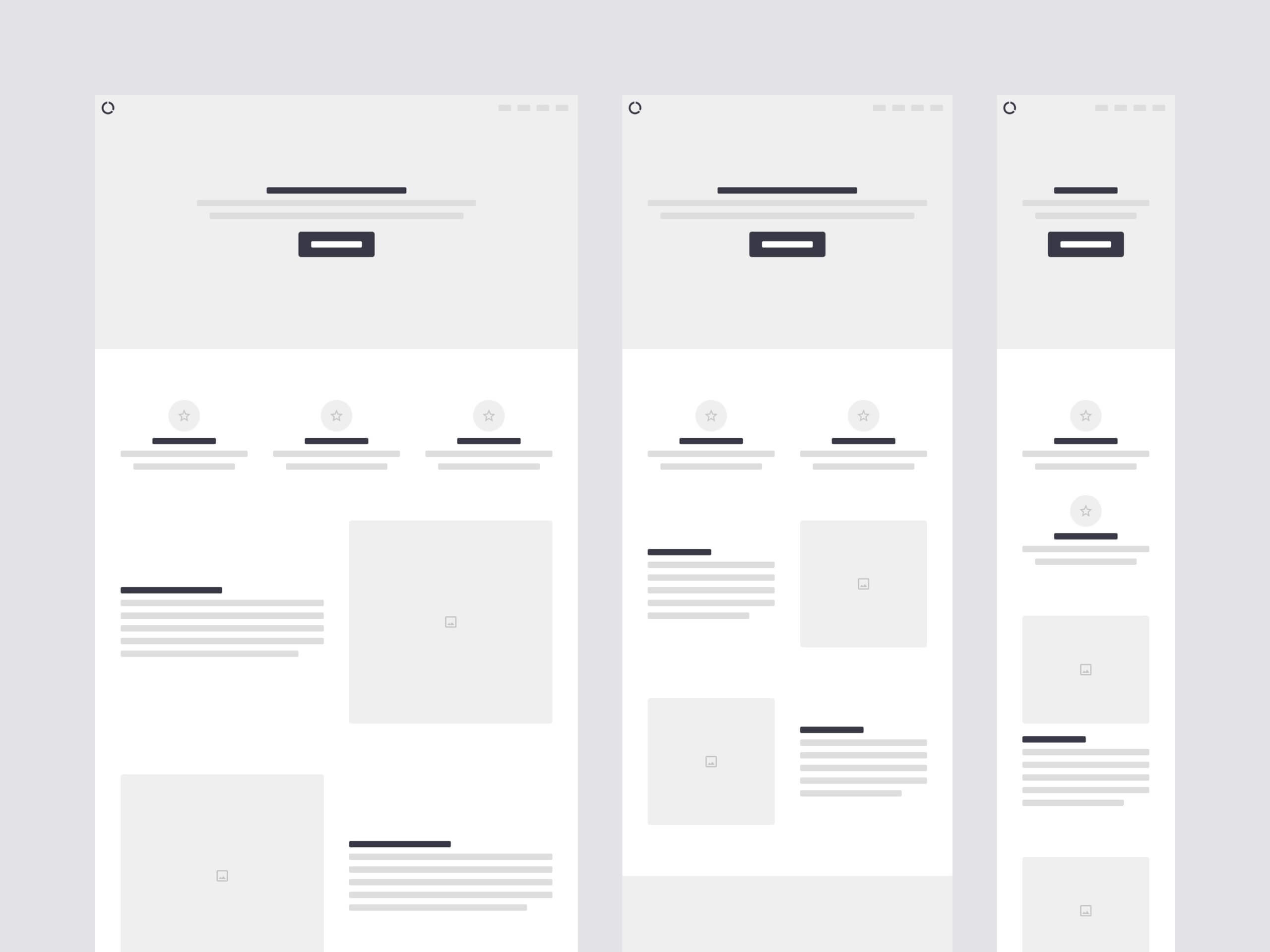
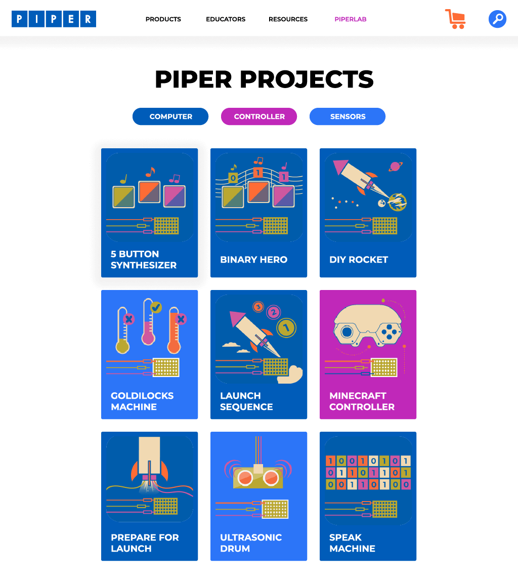
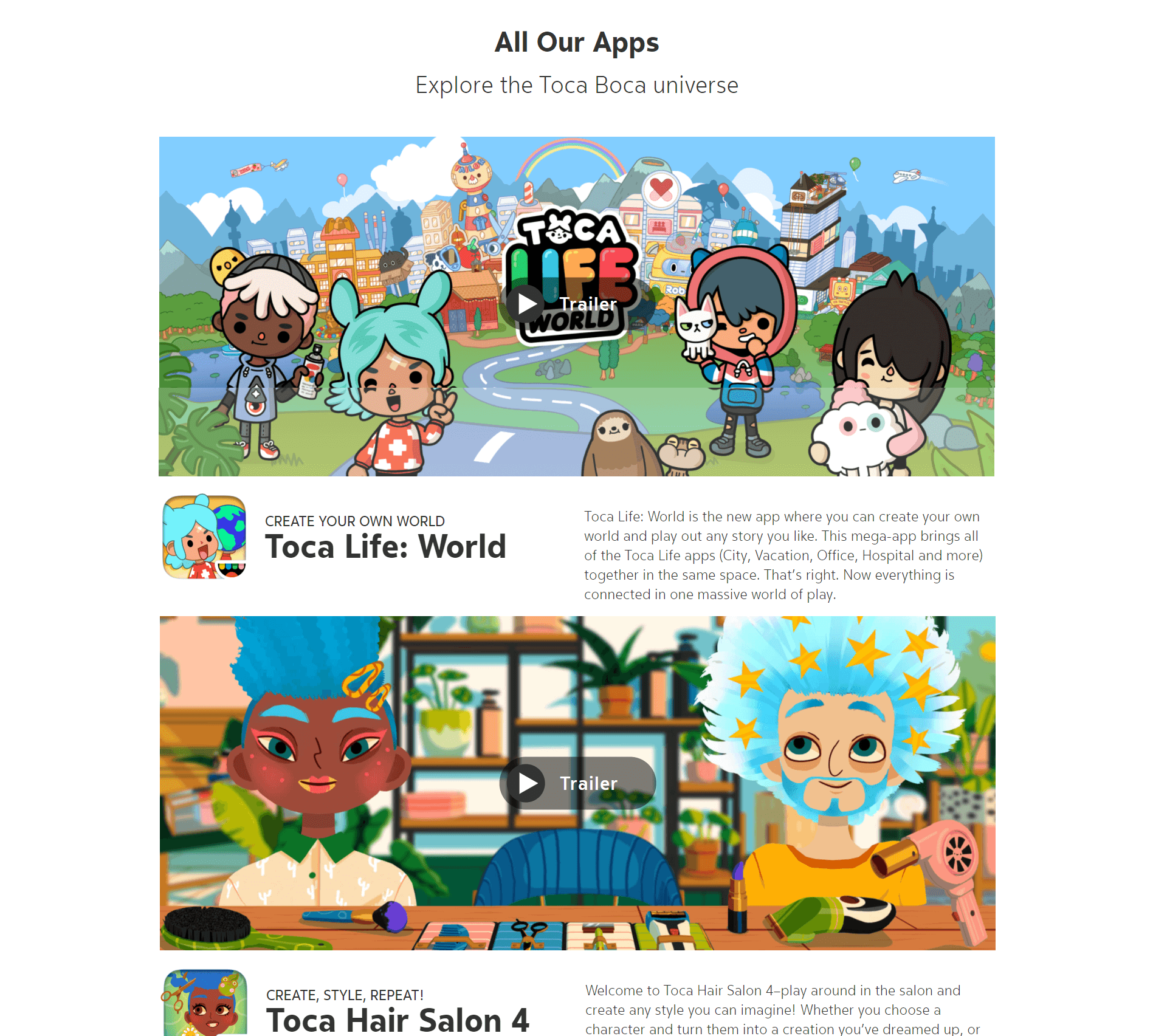
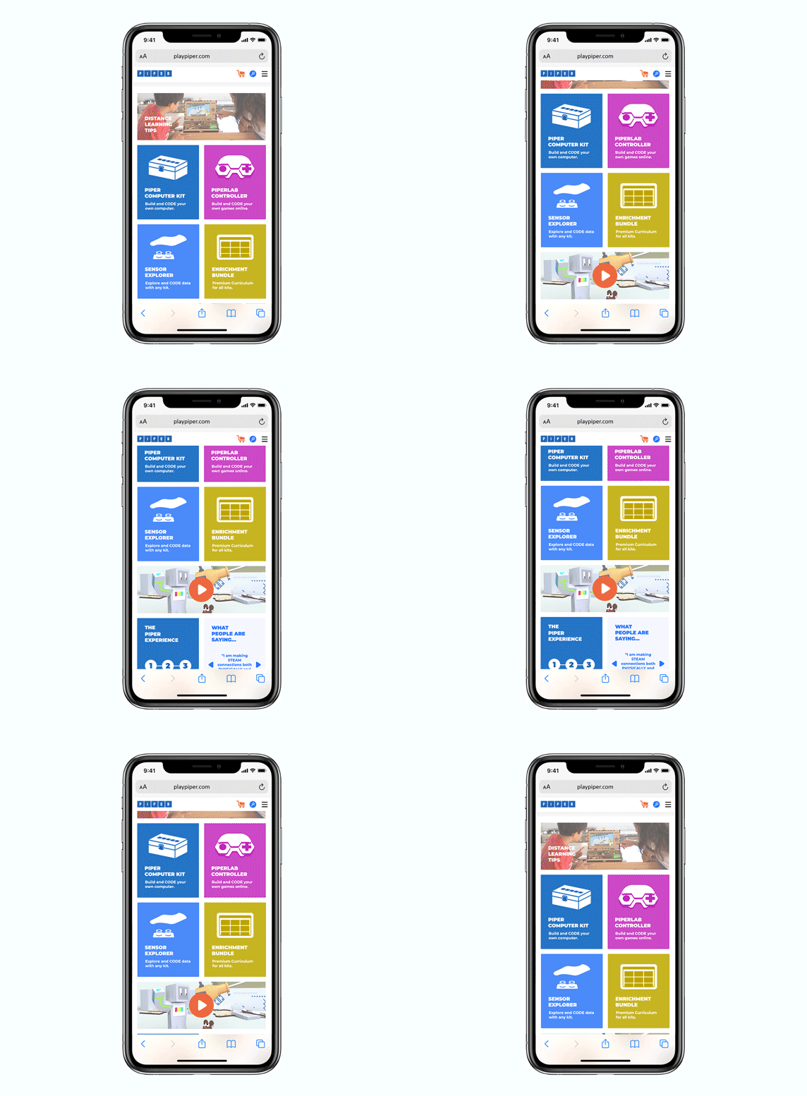
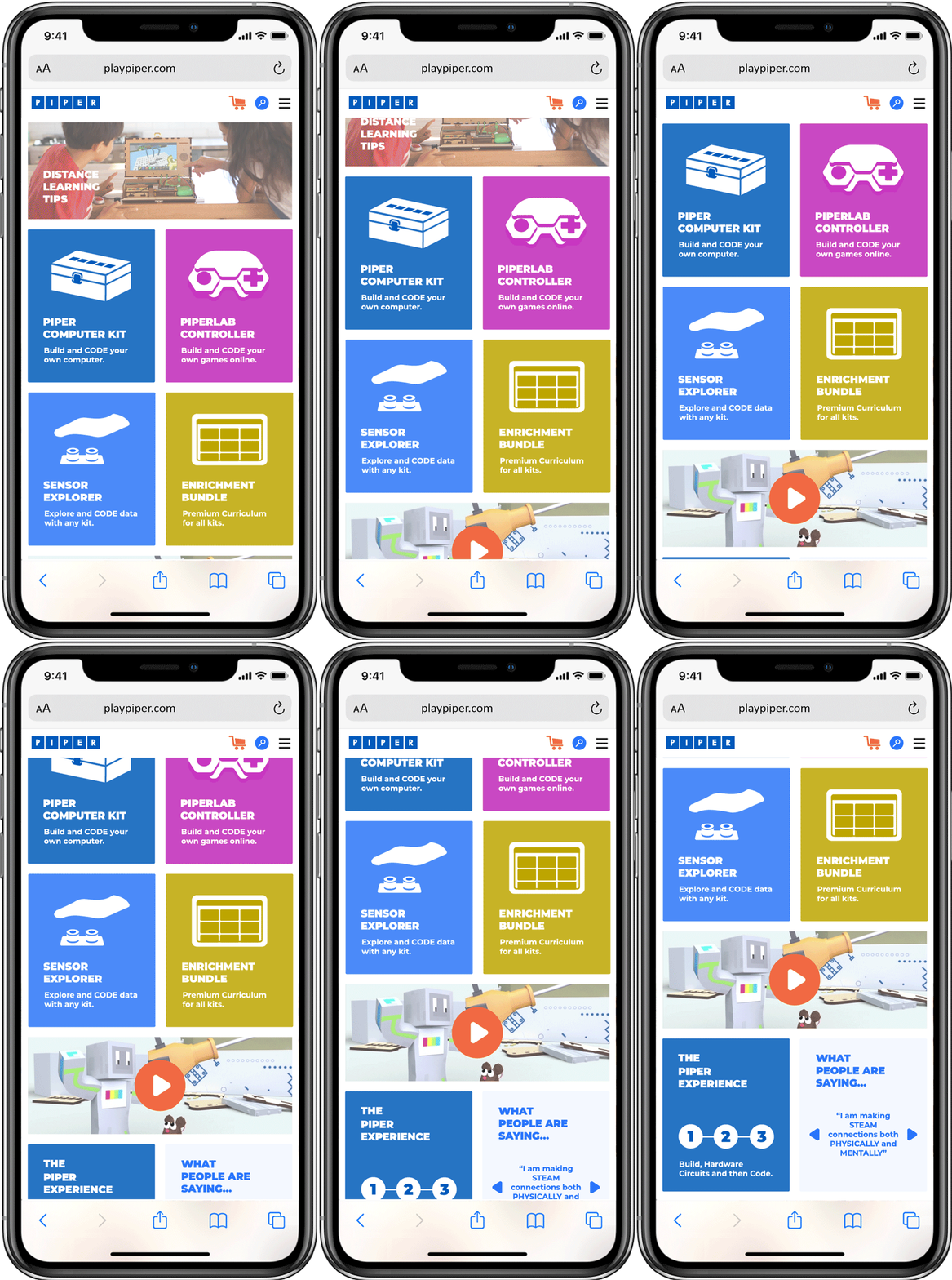
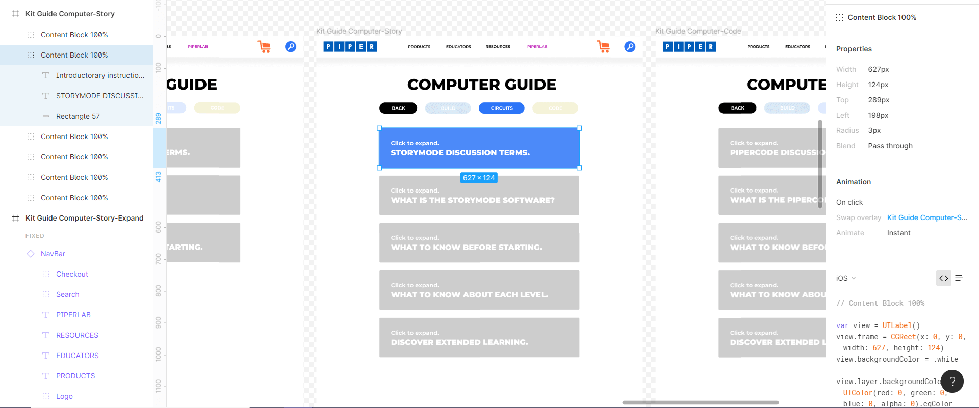
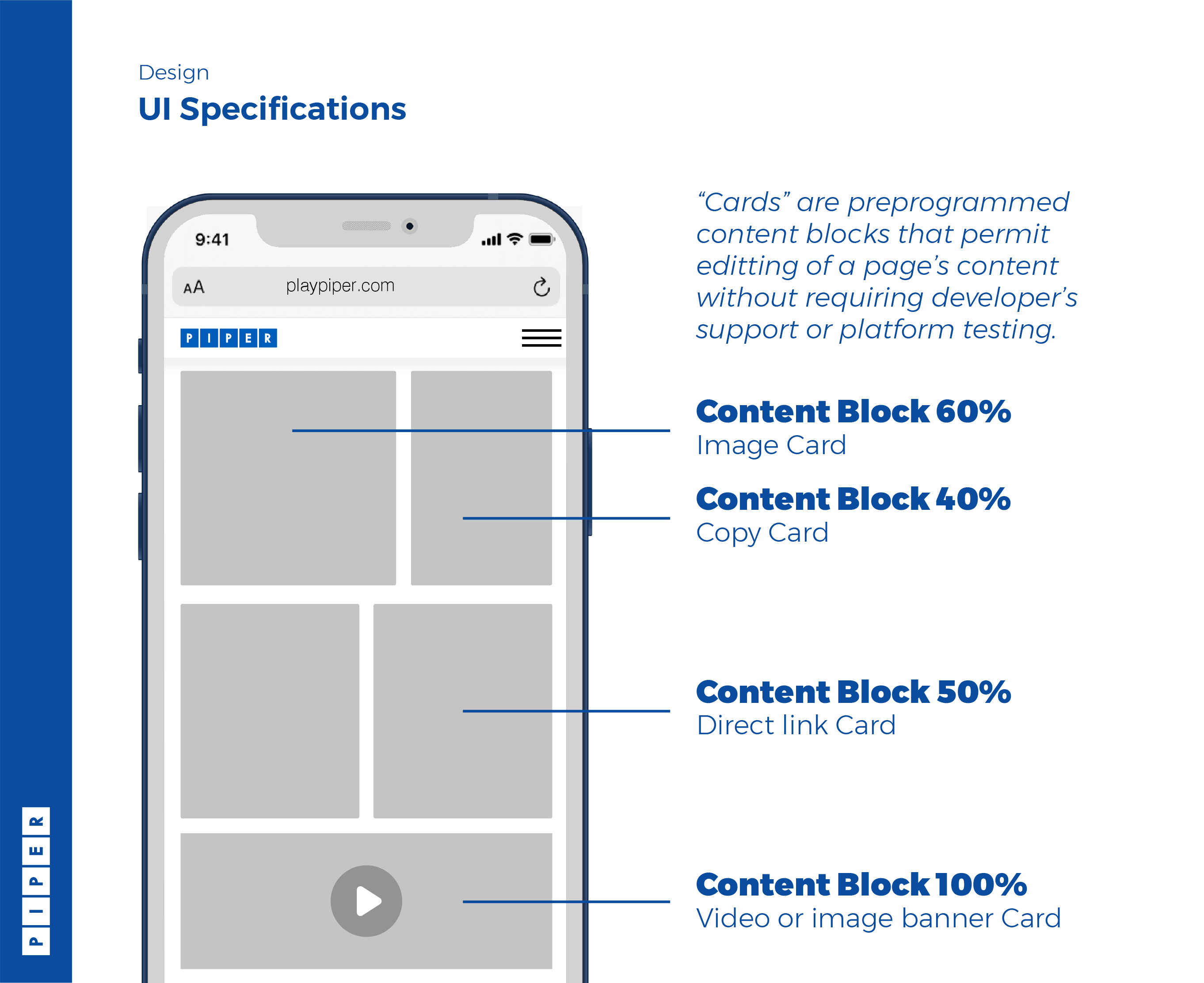
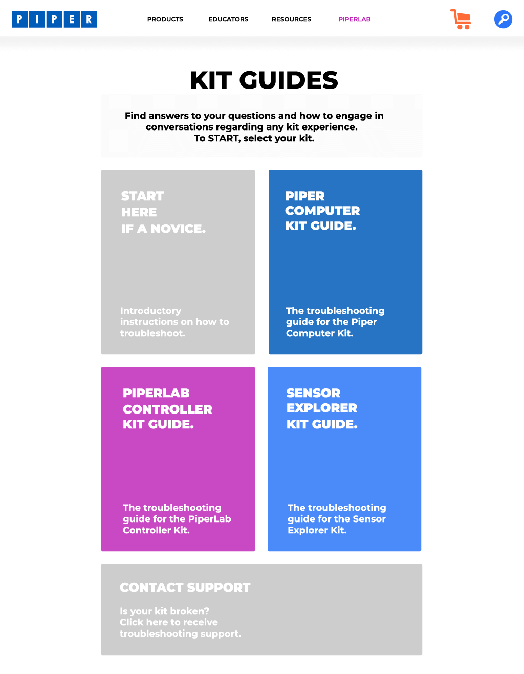
If the company designs a modular architecture one time, the site’s content can easily be adjusted for both Educator & Parent facing audiences at all times. Modular content blocks lower development costs and free up time for content development. Most importantly, the blocks are designed for any platform and do not require further testing.
THE DESIGN.
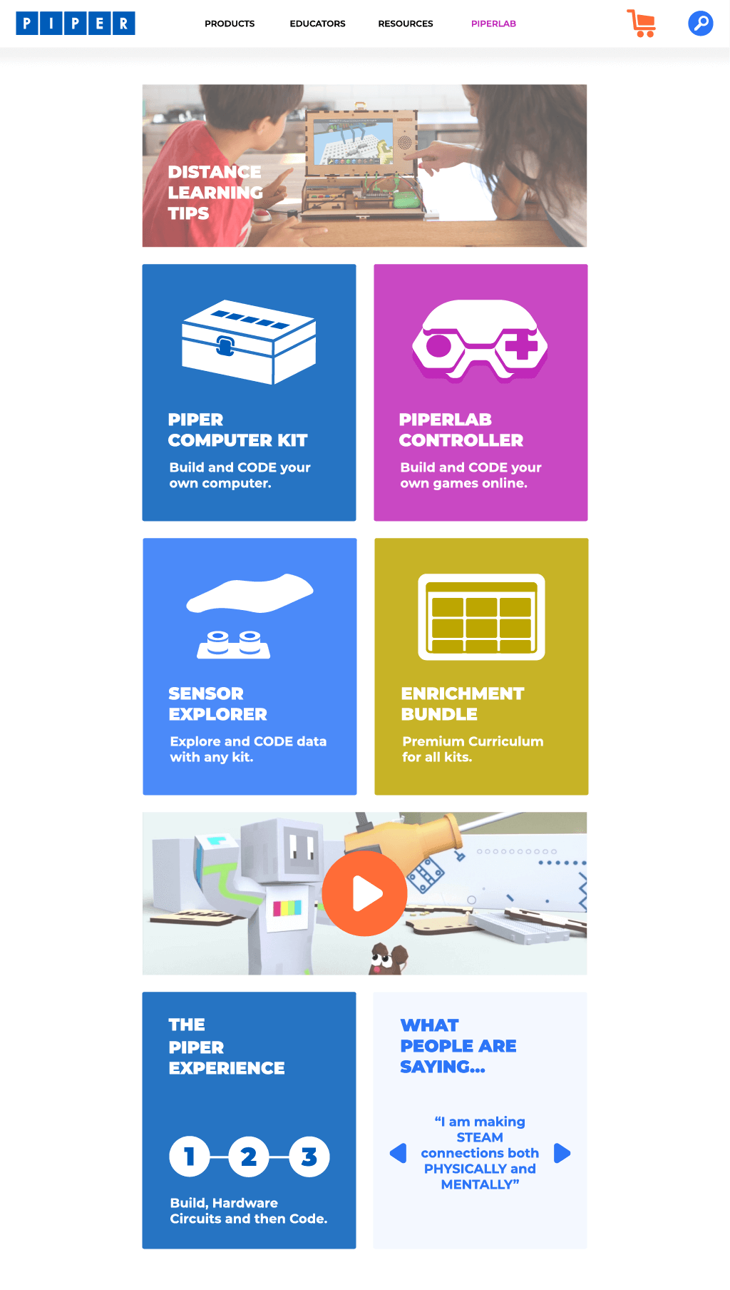
Content blocks designed to be responsive and modular for any type of content or platform eliminated the stress of multiple design reviews and iterative sprints by the engineering team.
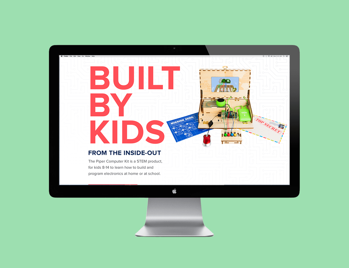
ORIGINAL.

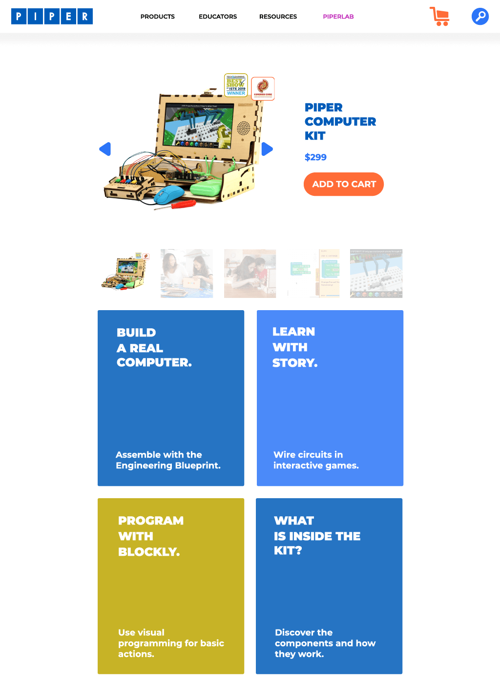
FINAL RELEASE.
RESEARCH.
THE FEEL.
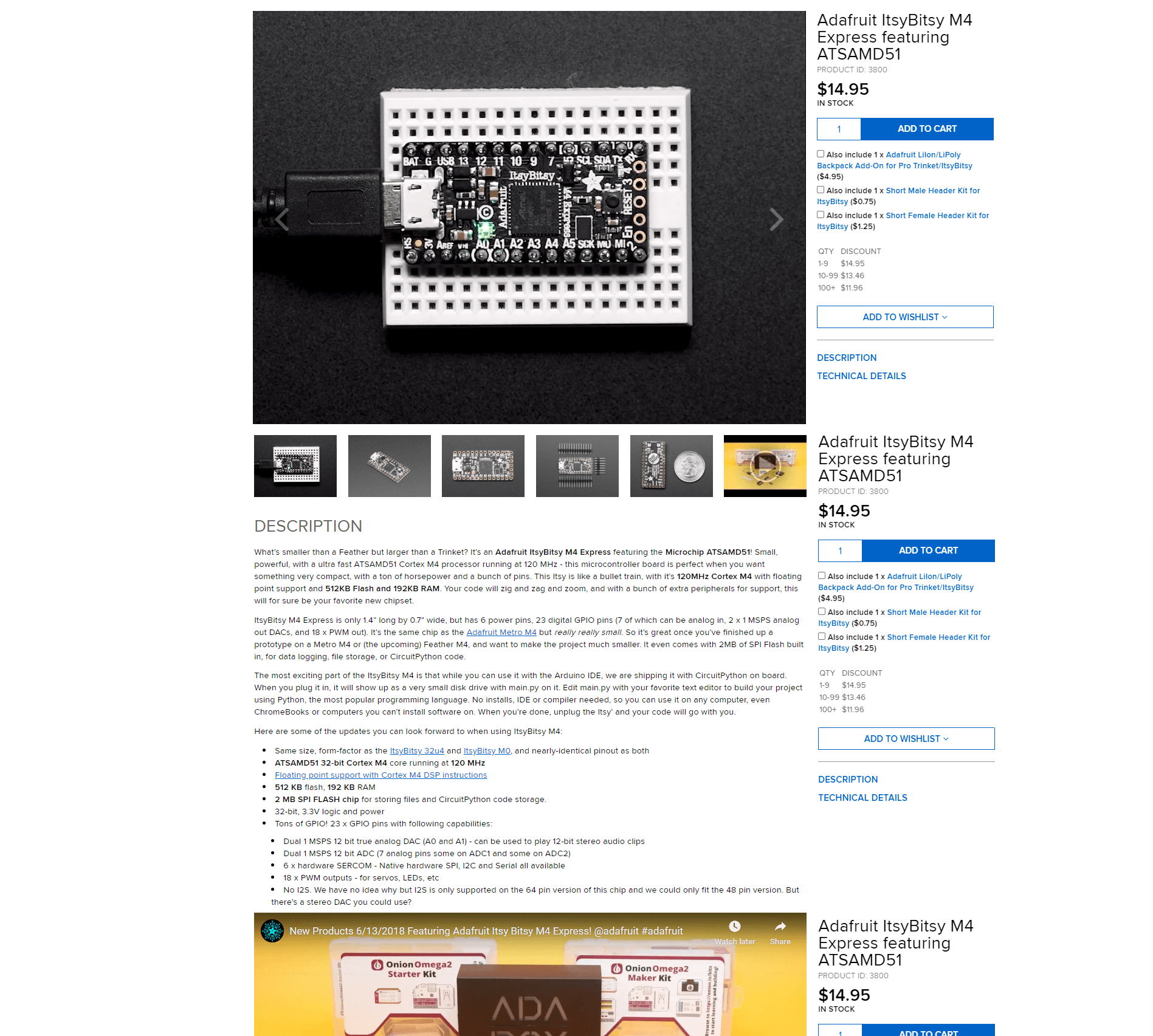
Condensed product content to speed up product evaluation.
PLAYBOOKS.
TECH SPECS.
UI SPECS.
DEVELOPMENT.
SITE ARCHITECTURE.
PERSONAS.
USER MAPPING.
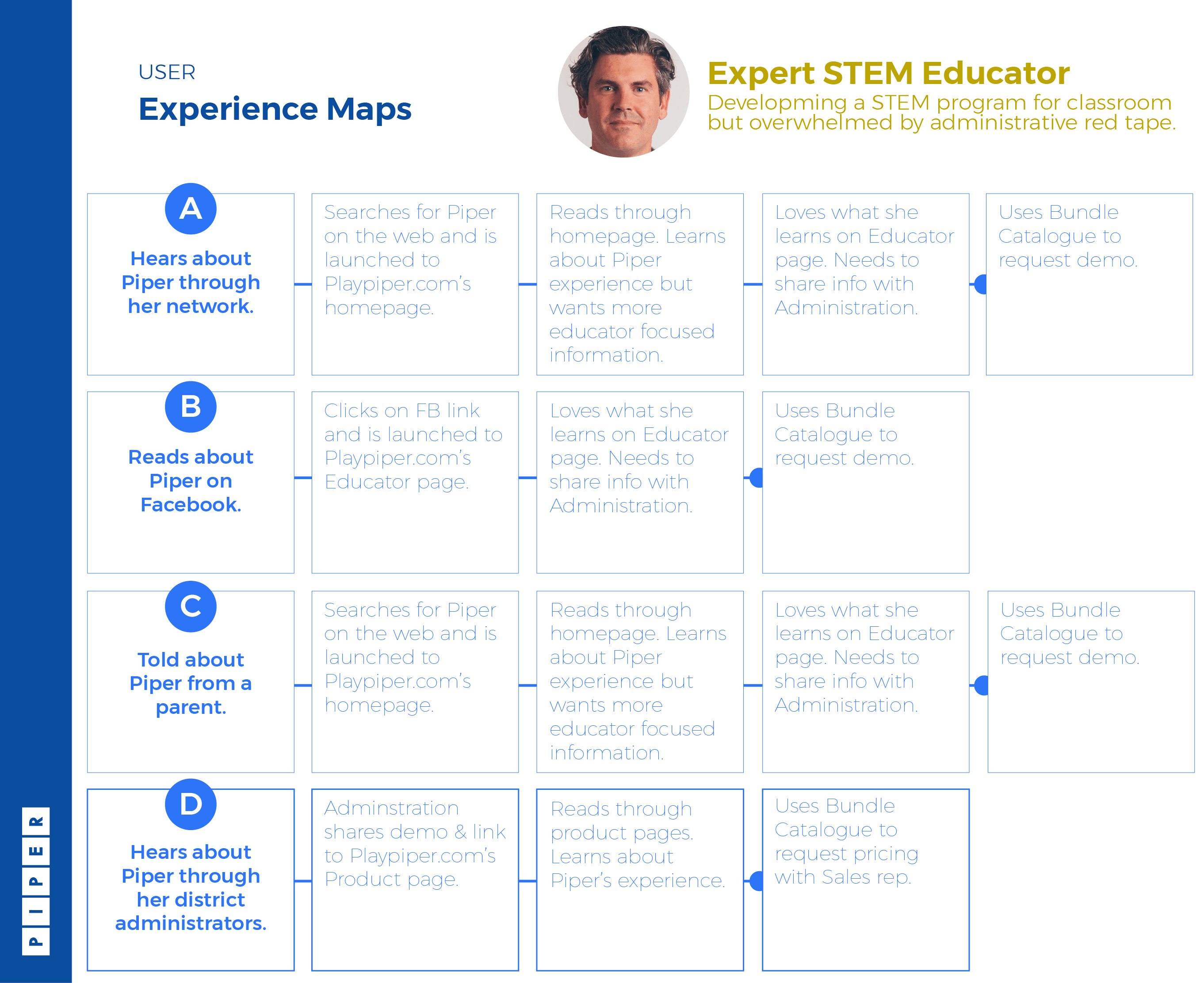
ACCESSIBILITY.
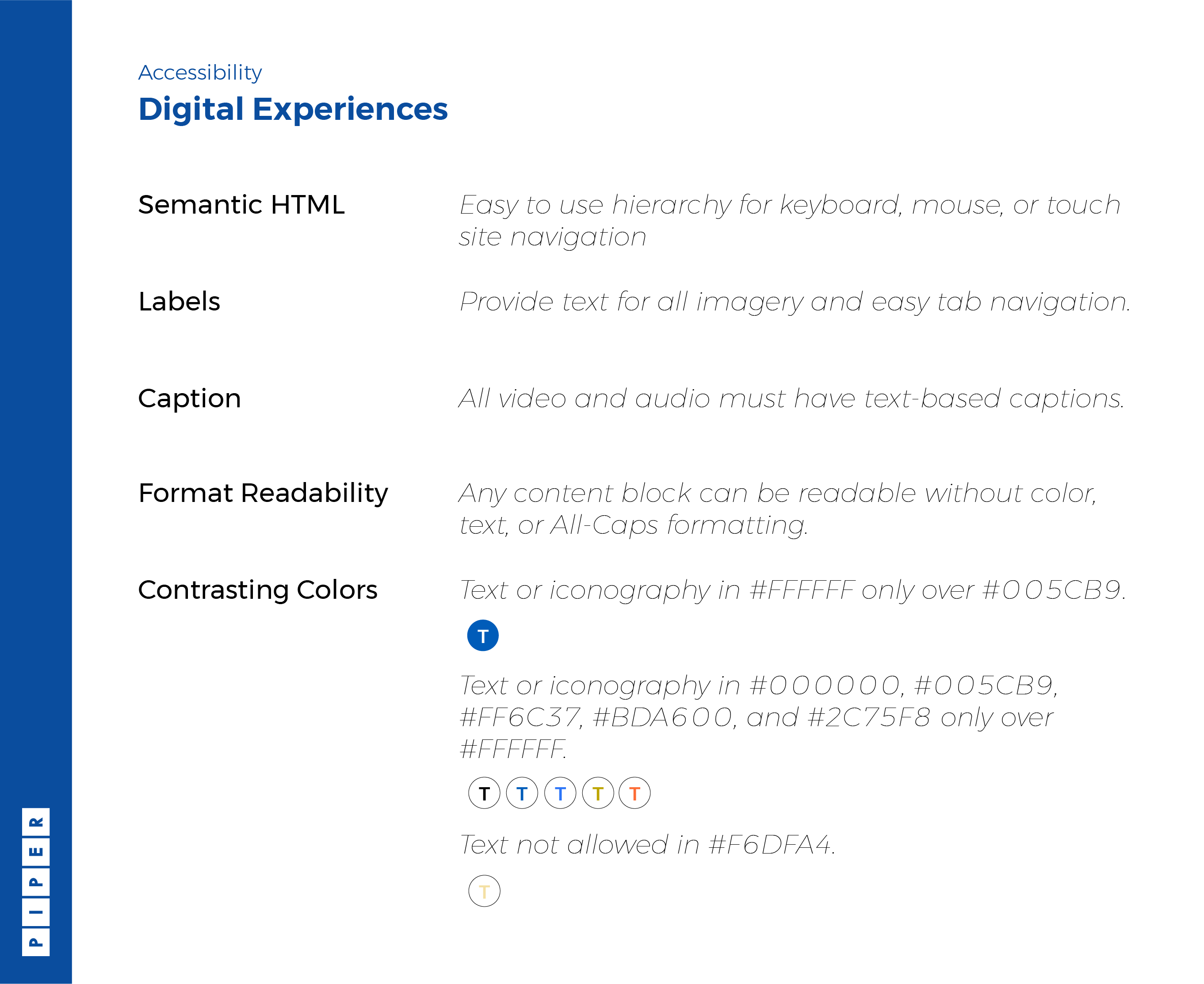
To improve accessibility, I removed all CAPS from typography rules, improved keyboard functionality, changed contrast colors, ....
TESTING SPRINTS.
CARD SORTING.
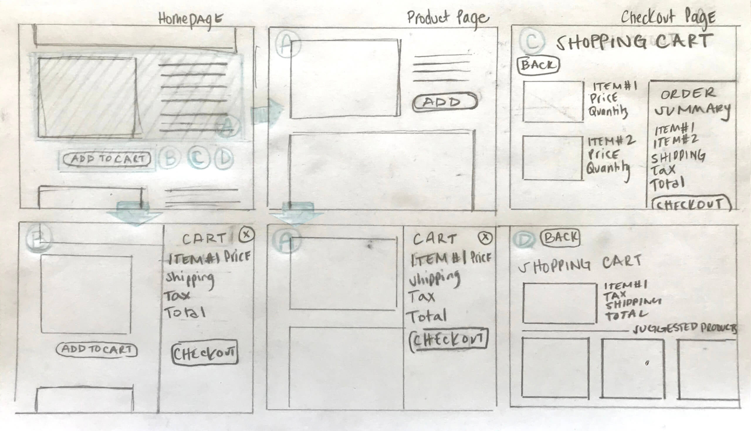
To improve sessions, we knew we needed to shorten the time from product adding to cart and purchase completion. To determine final aesthetics and UX, I lead the testing through various rounds of internal team card sorting sessions, online A/B testing, and external playtesting with users in the field.
INTERACTIVE PROTOTYPES
To test how comfortable users were navigating the card style content blocks, I design quick click through prototypes. Each new interactive feature is built into the quarter's KPIs to monitor for improved sessions, cart completion, user content satisifaction, and repeat visits in regards for extended experiences.
MOCKUPS.
RESOURCES.
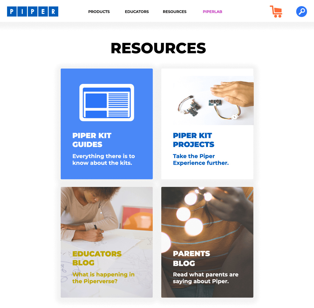
GUIDE NAVIGATION.
BLOG FILTERS.
