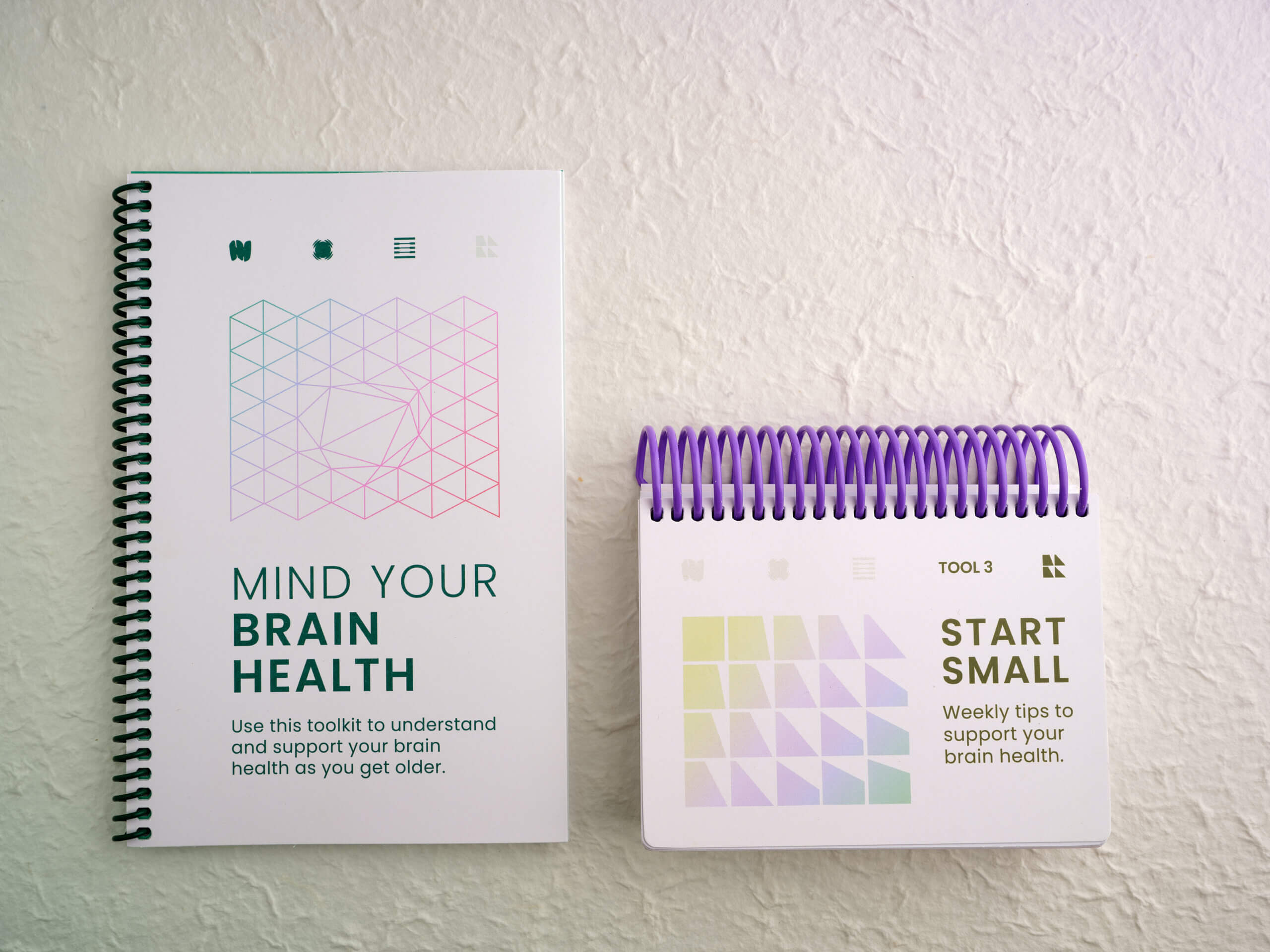
BRAIN HEALTH TOOLKIT
Led R&D on first-ever product ecosystem for the California Department of Public Health’s Healthy Brain Initiative. Collaborating with experts from UCSF and USC, we launched the Brain Health Toolkit that empowers older adults with hybrid resources to understand changes in their memory and thinking, make the most of their time with their doctor, and take steps to keep their brain healthy.
01 ► Refresh Your "Senses"
02 ▼ Opportunity
The number of people living with Alzheimer’s disease and other forms of dementia is on the rise, with many not knowing they even have it. A lot of 55+ adults seek prevention opportunities but are inundated with misleading and possibly harmful products. Some hold stigmatized assumptions surrounding dementia and brain health. While most just distrust their primary care teams.
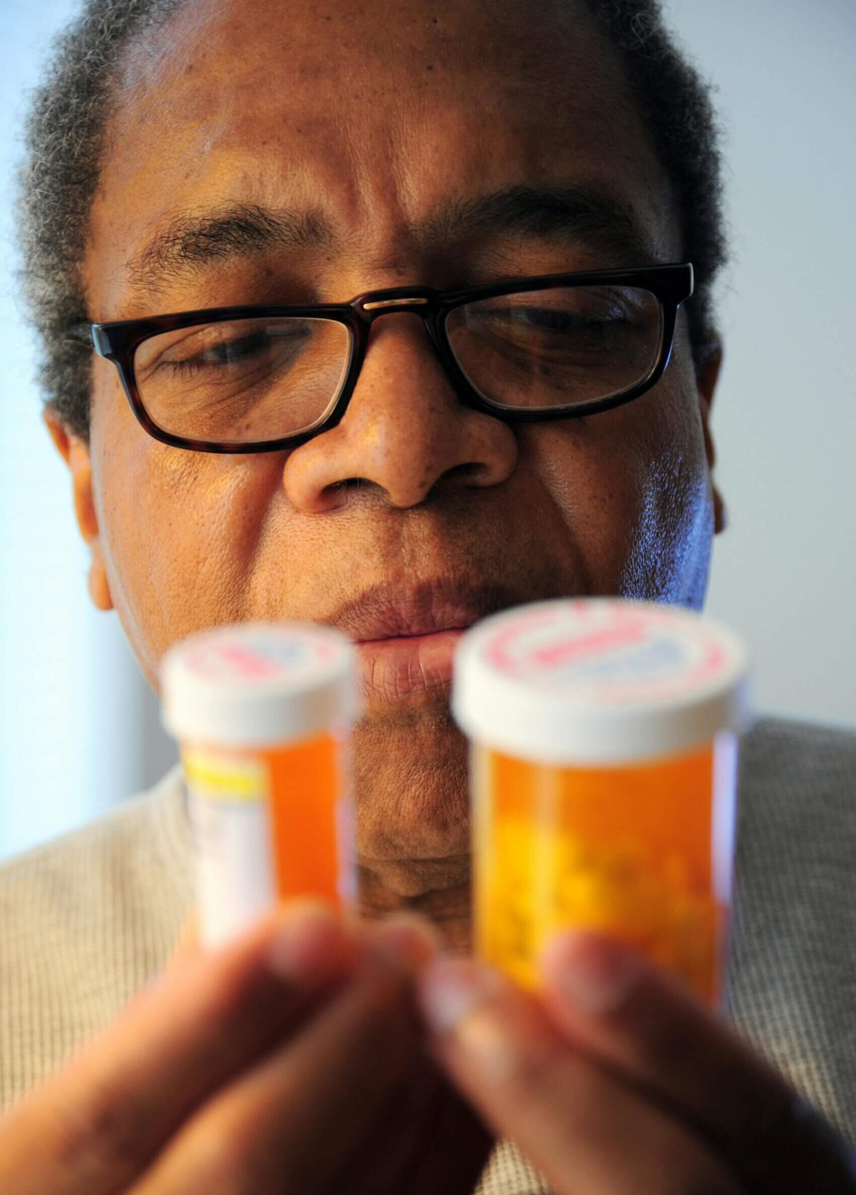
Under the guidance of dementia experts at CDPH and UCSF, I led R&D on a product series to destigmatize, increase awareness and support earlier detection of dementia among 55+ adults and their loved ones. We began by asking how do we design a grassroots campaign that leverages organic communication supporting brain health prevention to genuinely engage the community?
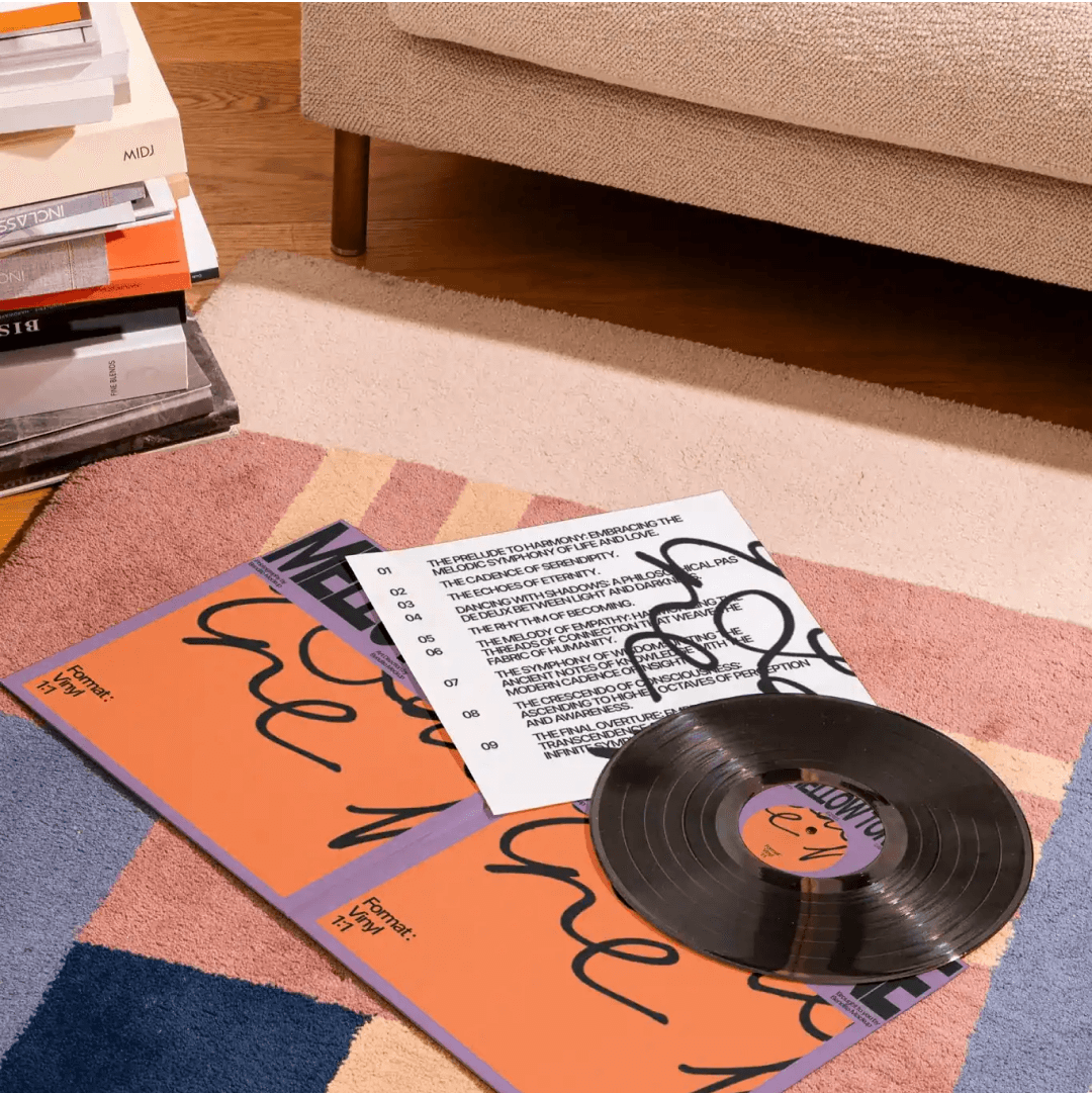
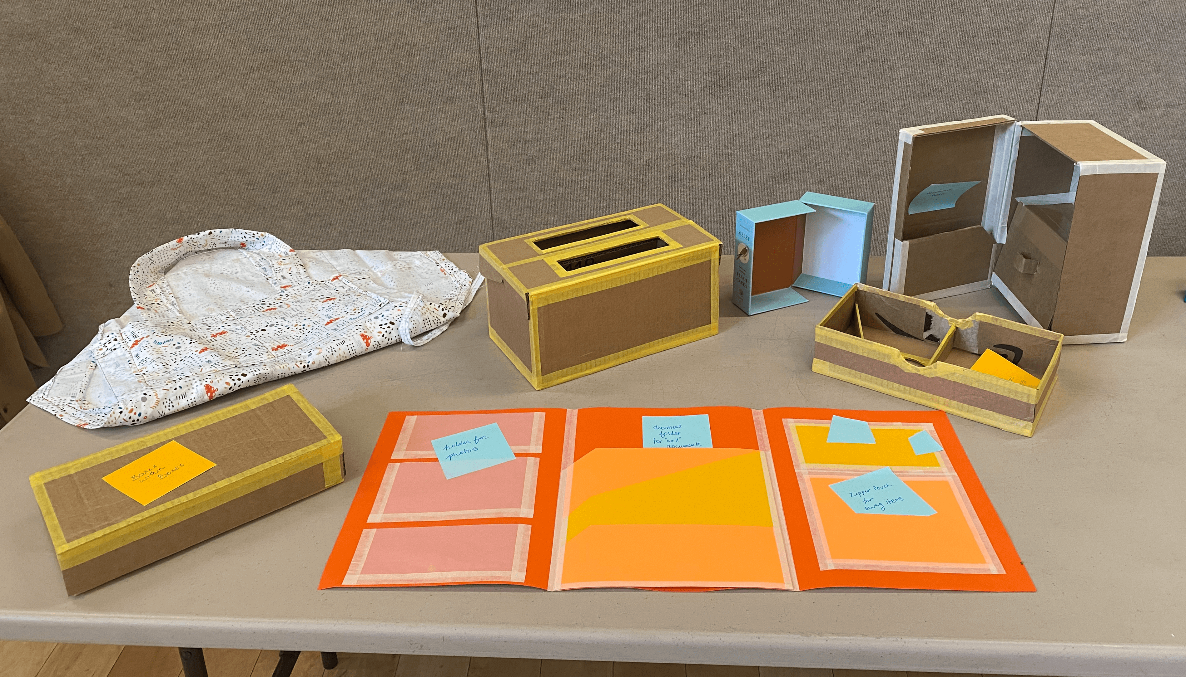
03 ► Physical Kit Features
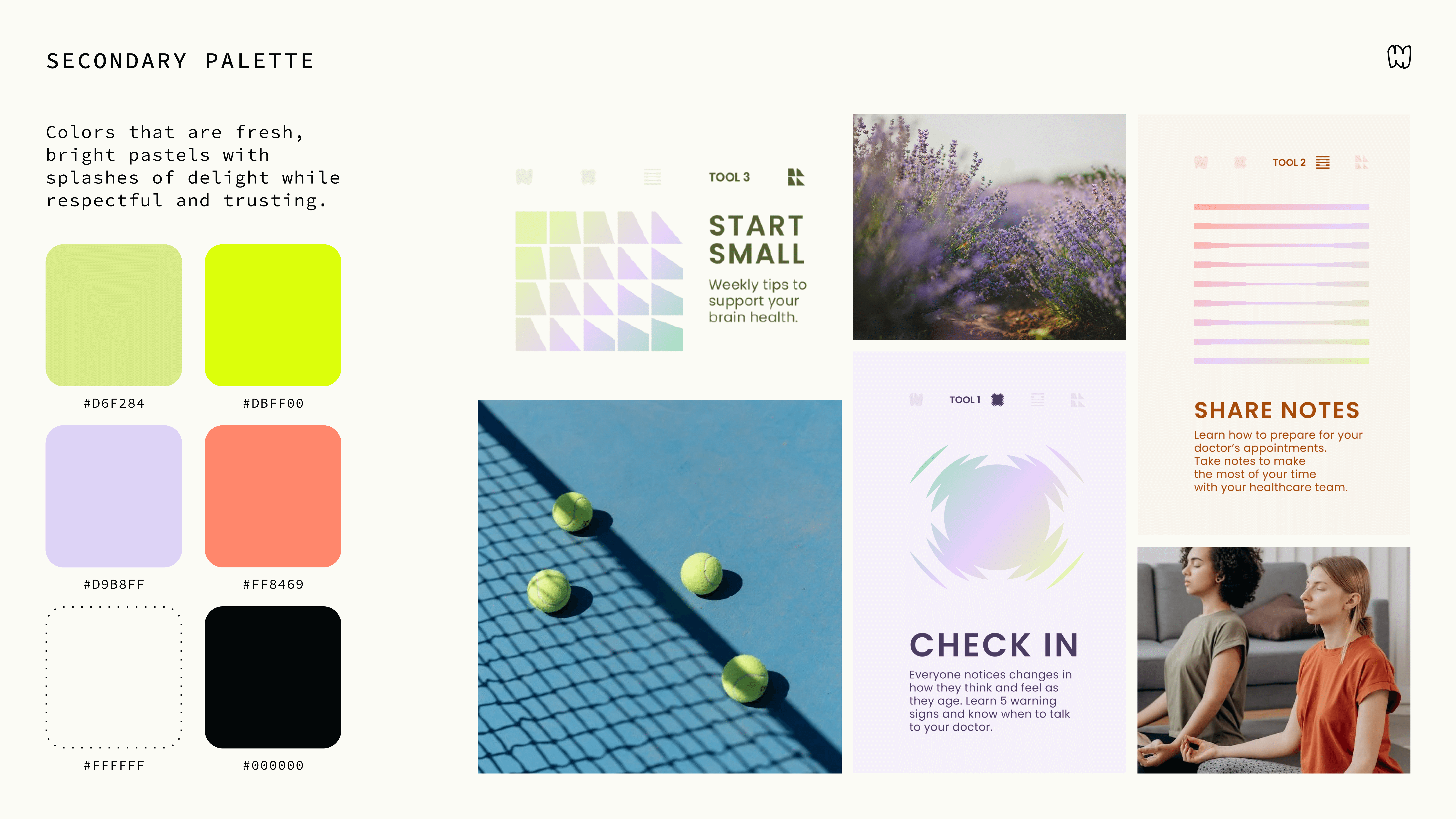
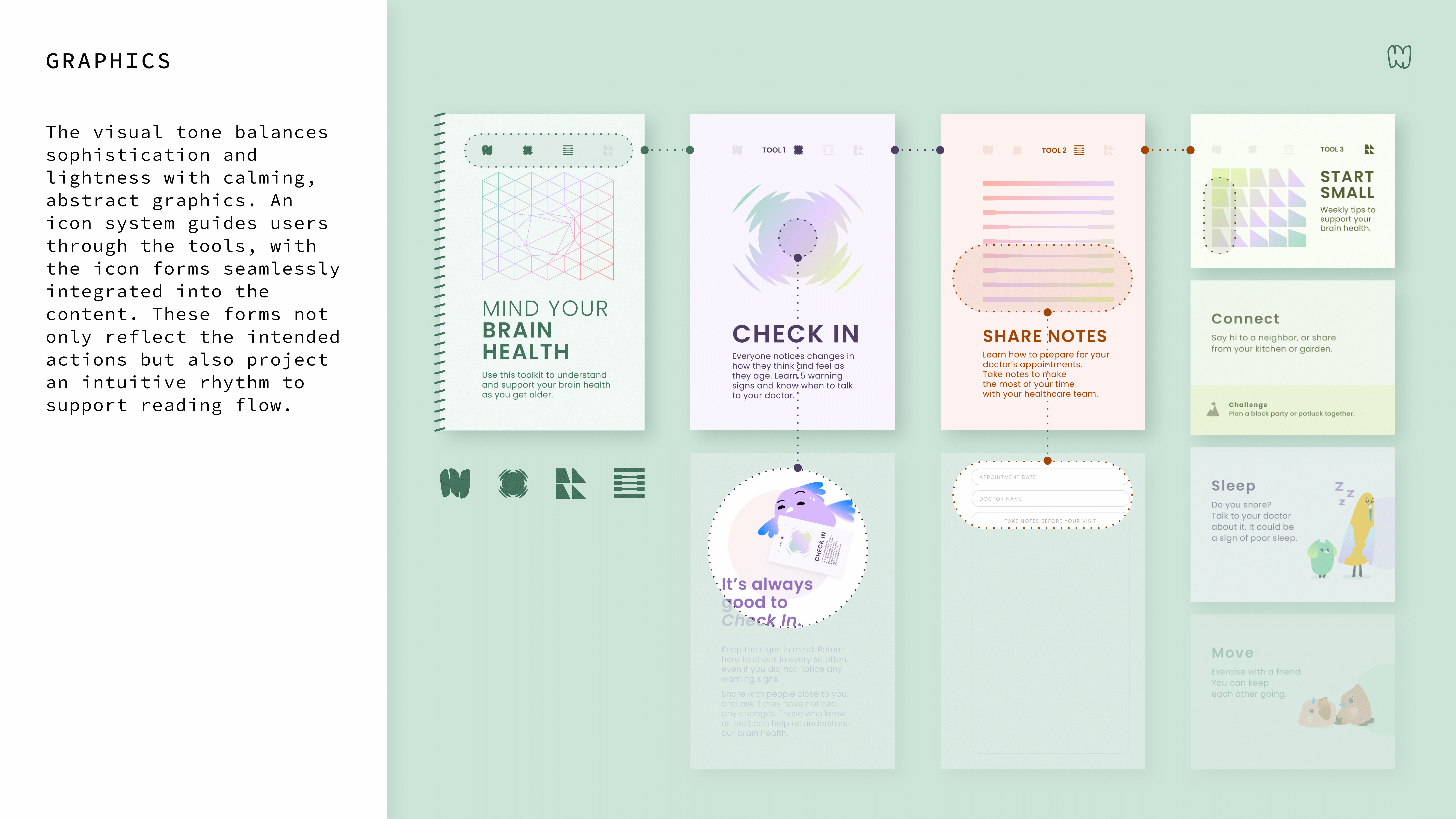
These collated, patient-facing tools provide sought-after physicality for the less than tech savvy 55+ audience. While its calming and unconventionally refined color palette invites users in, the playful bird characters and positive but straightforward tone offsets the serious subject matter.
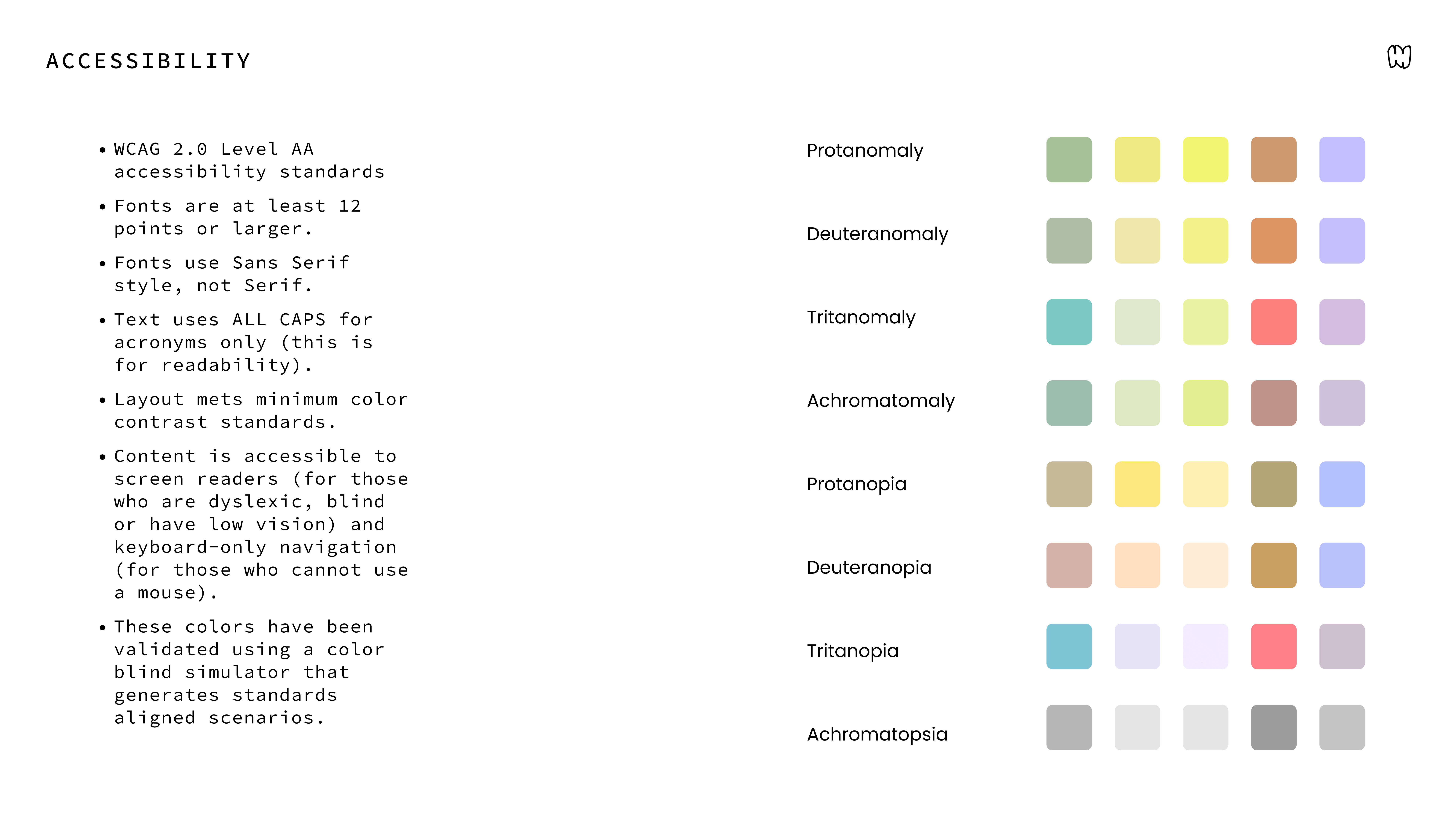
Each tool is titled as explicit actions to encourage active engagement. 5th-grade reading level, ADA compliance and recycled compostable paper printing advances standards in accessibility and sustainability within public health campaigns.
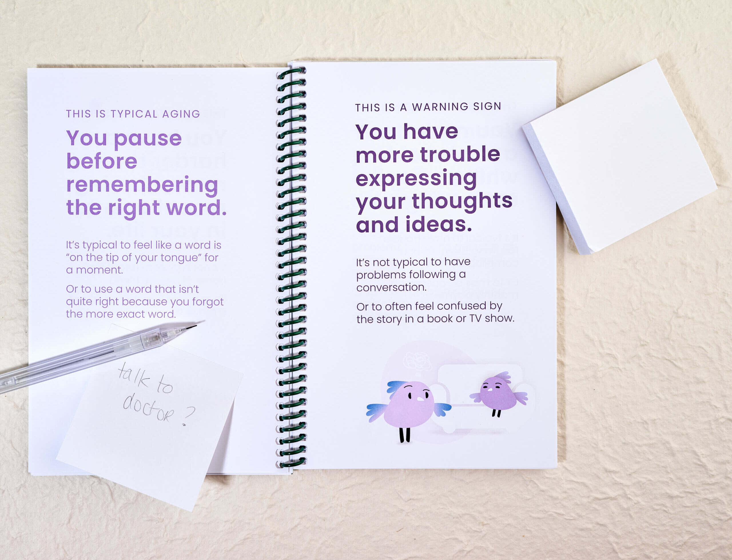
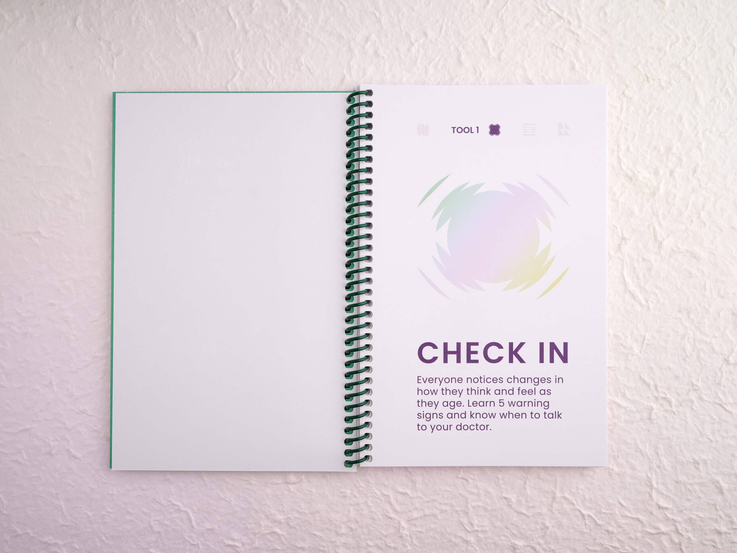
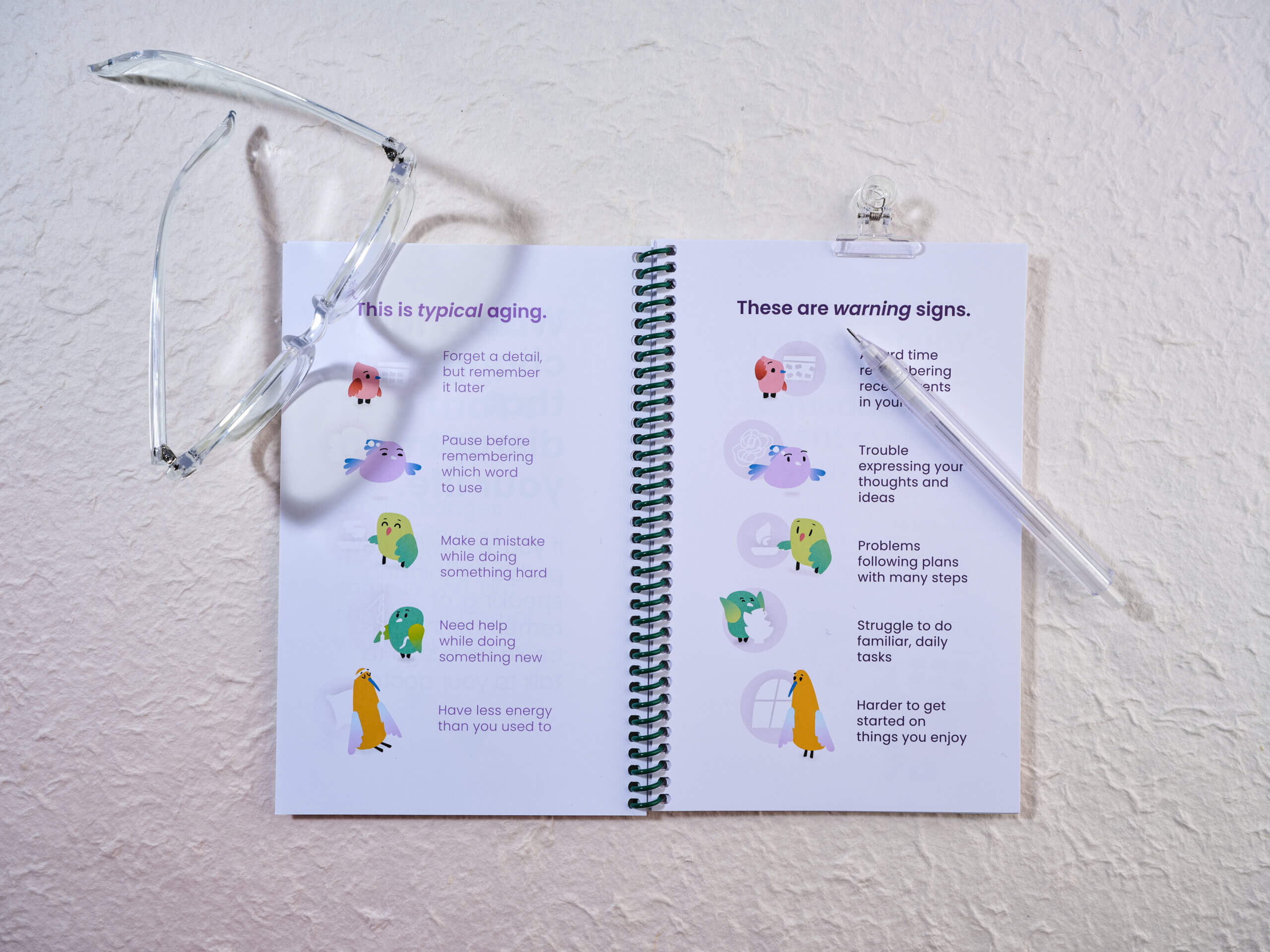
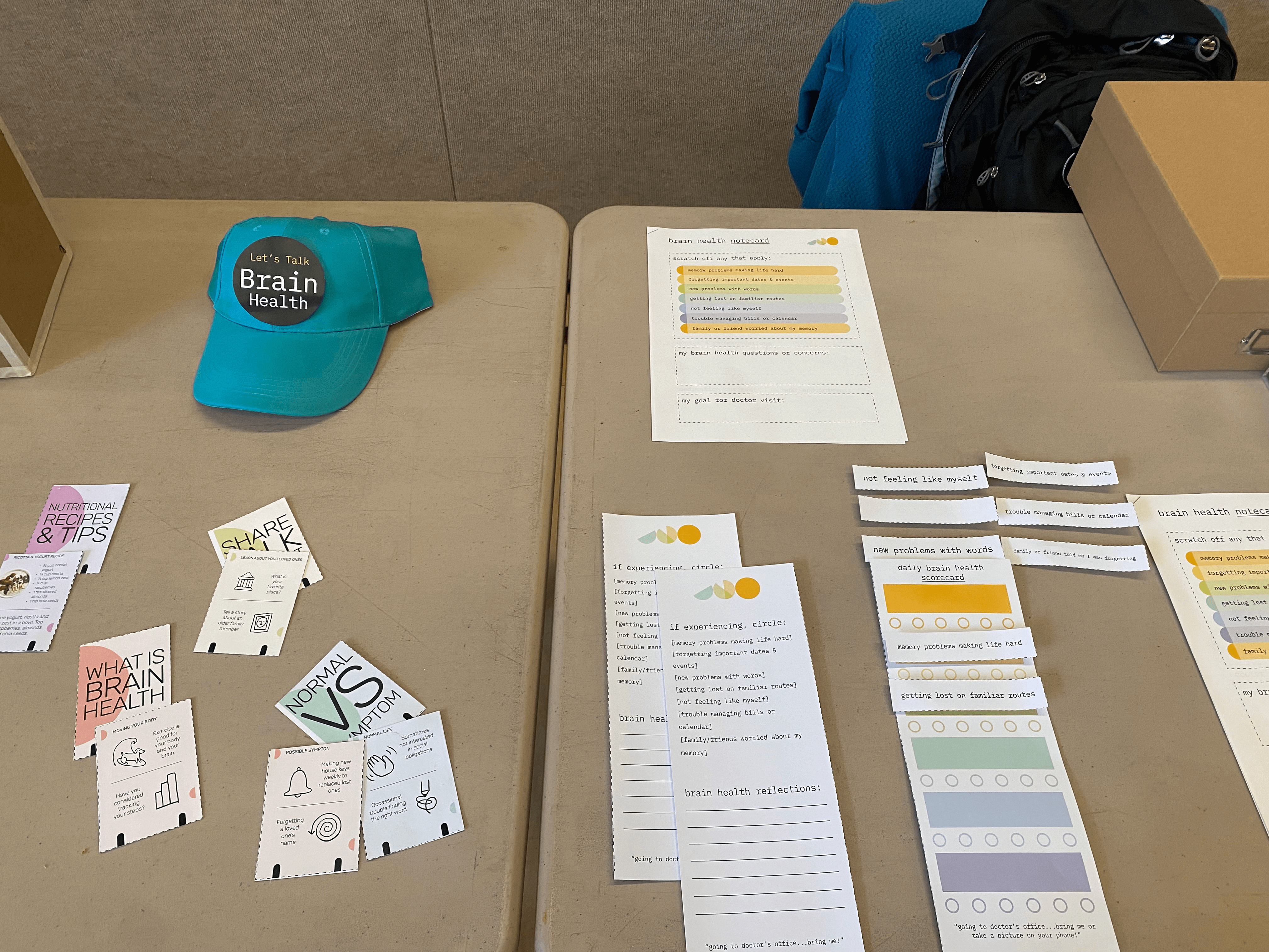
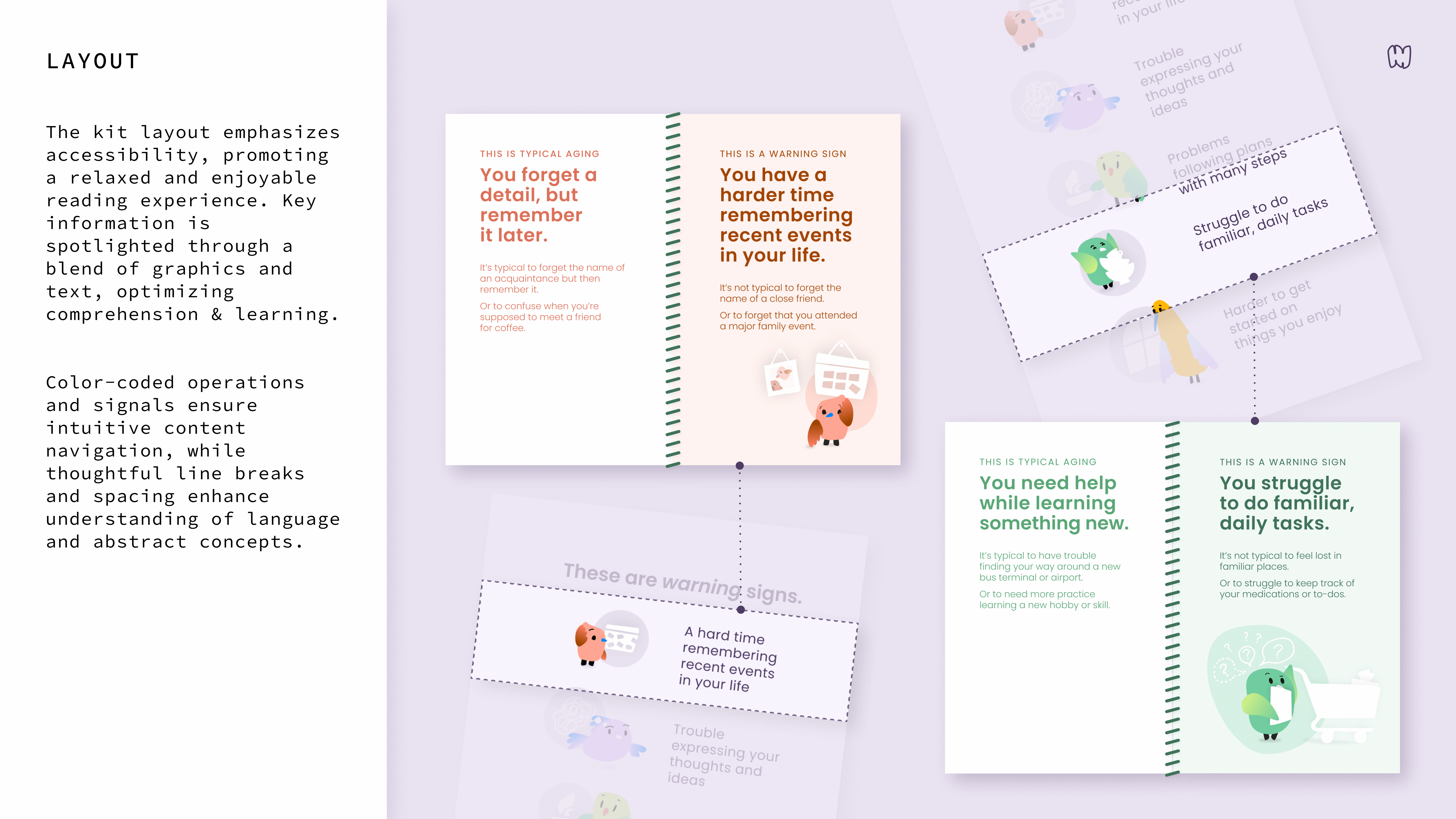
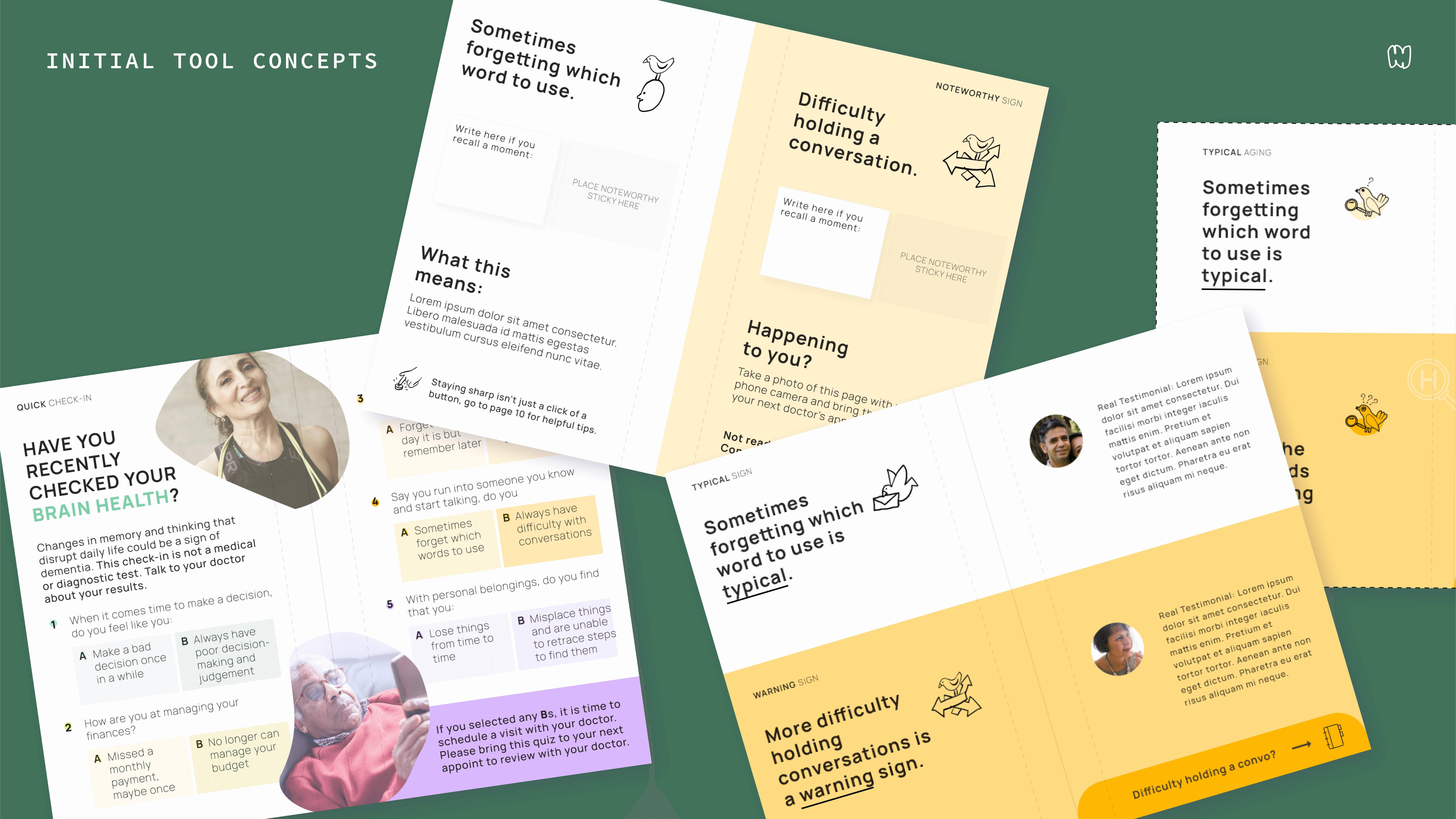
0A ● CHECK IN
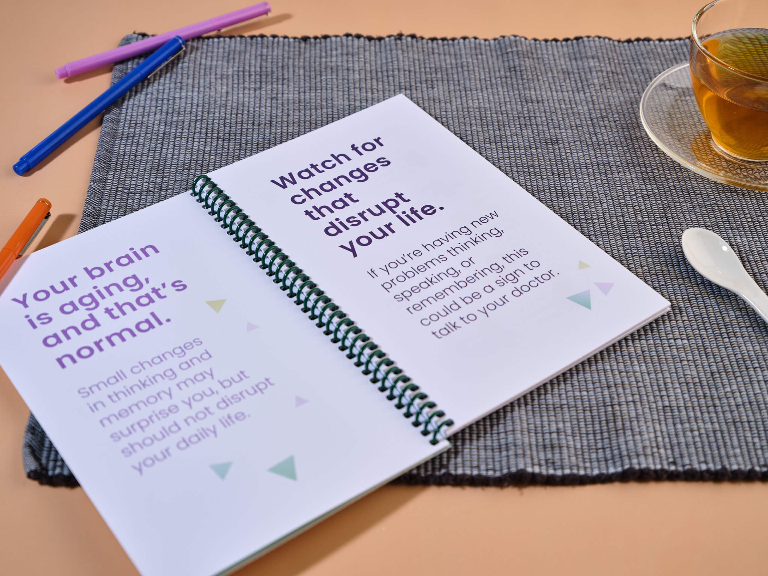
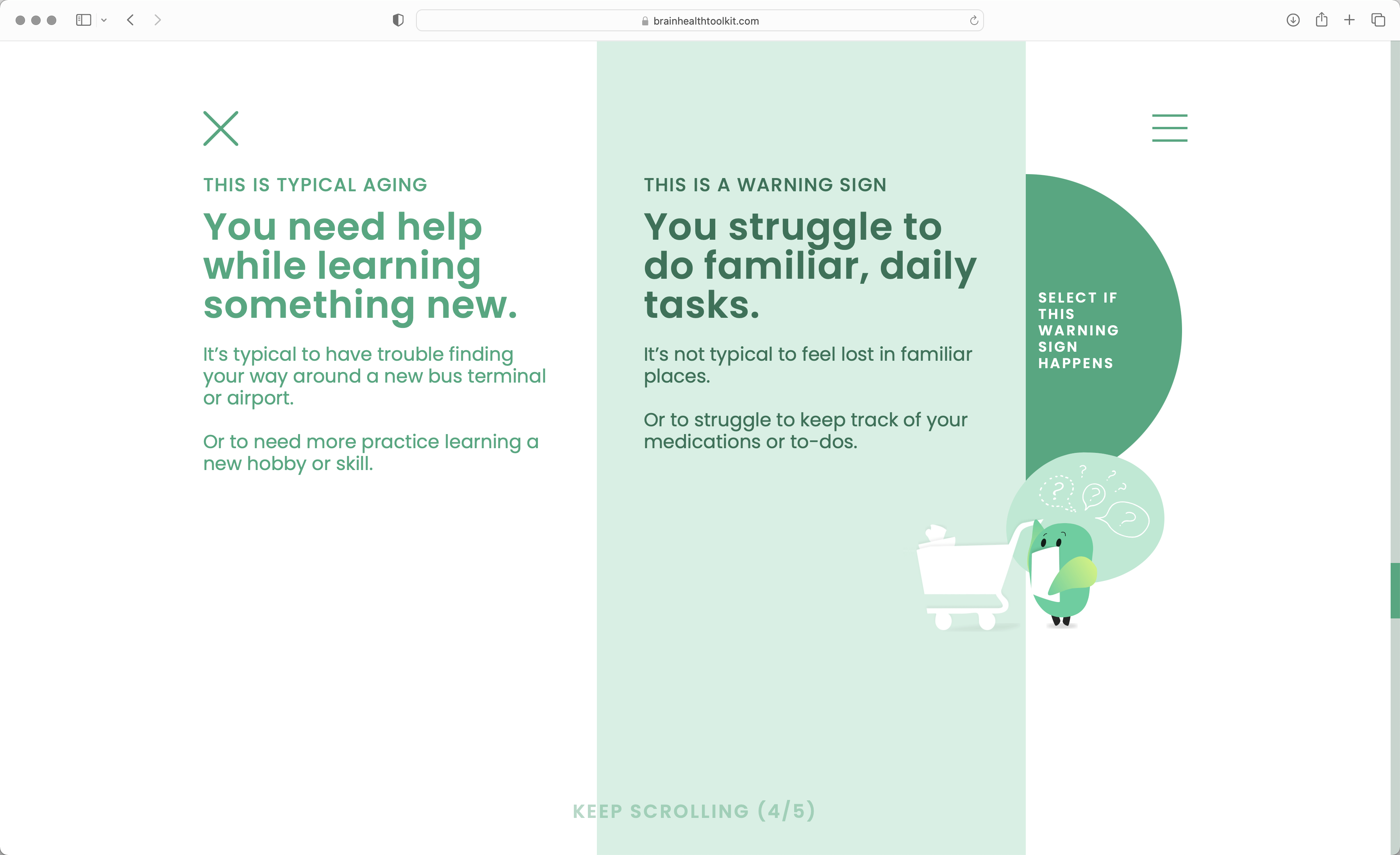
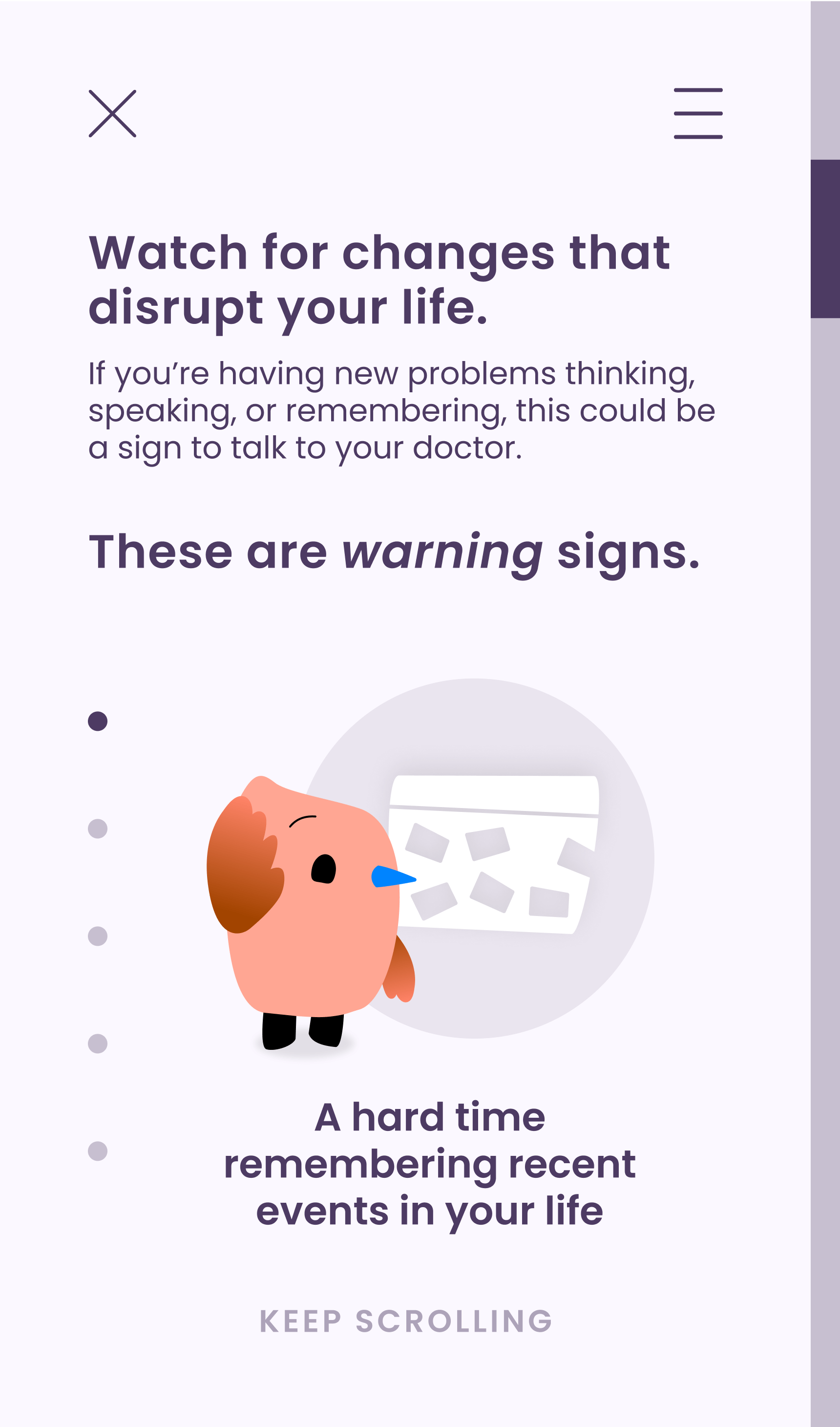
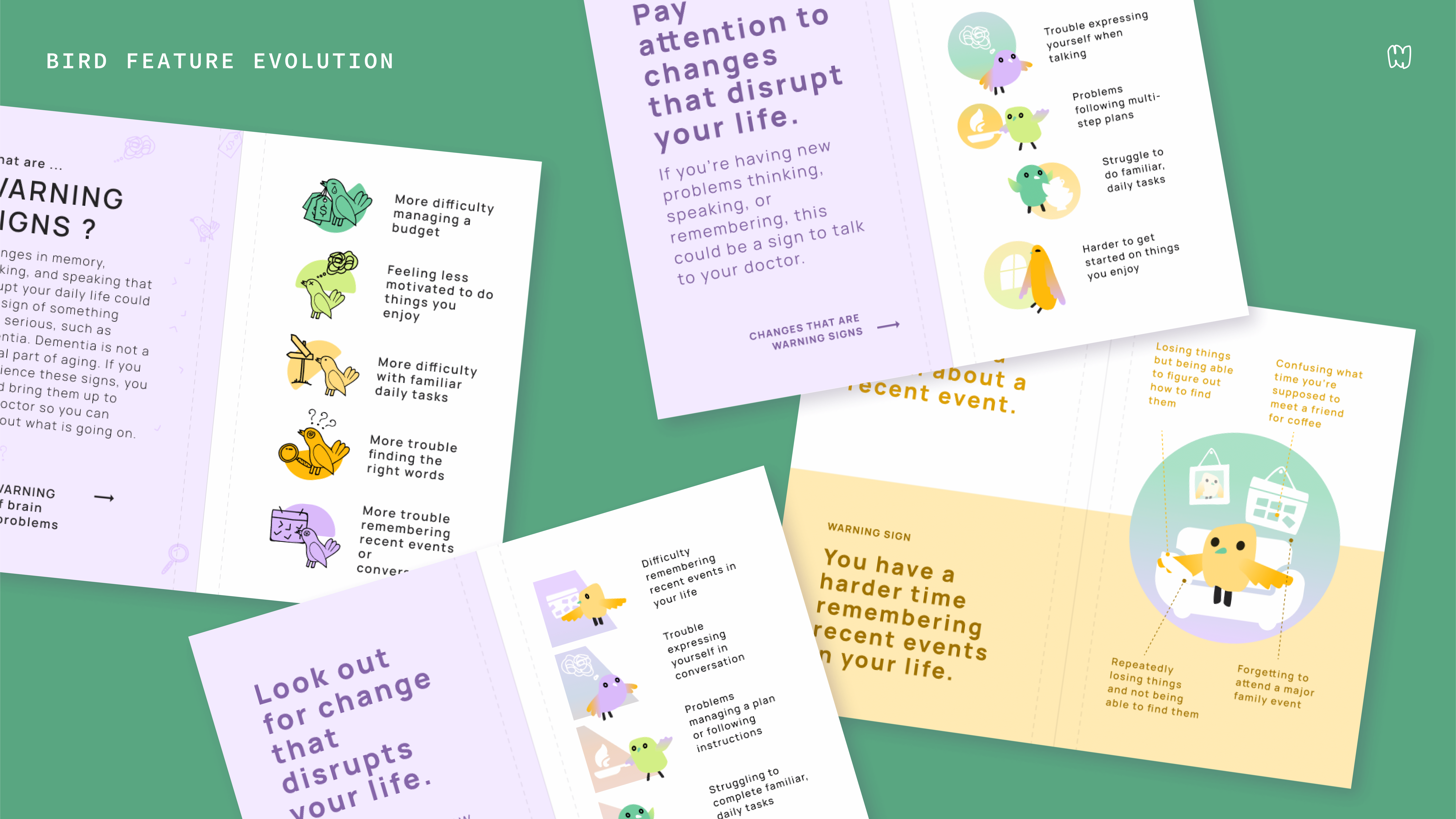
Expertly written and illustrated distinctions between early signs of dementia with typical experiences of aging are cloaked as pop-culture style quizzes. The color-coded layout frames the signs as signals with the use of supportive self-assessment language. The juxtaposed spacing also reduces cognitive load by facilitating intuitive navigation. Small journal size makes it easy to pass it on to a friend or family member.
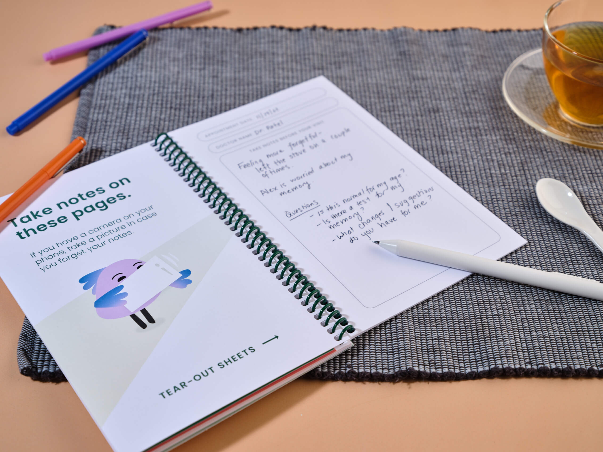
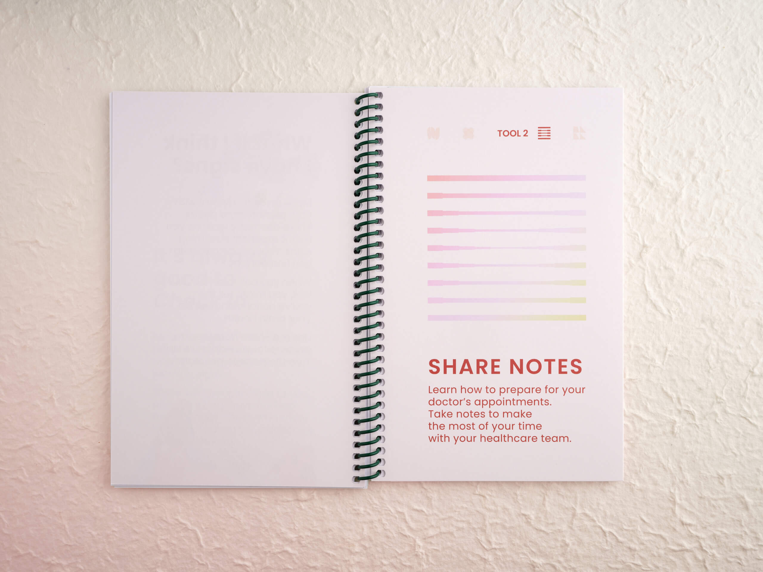
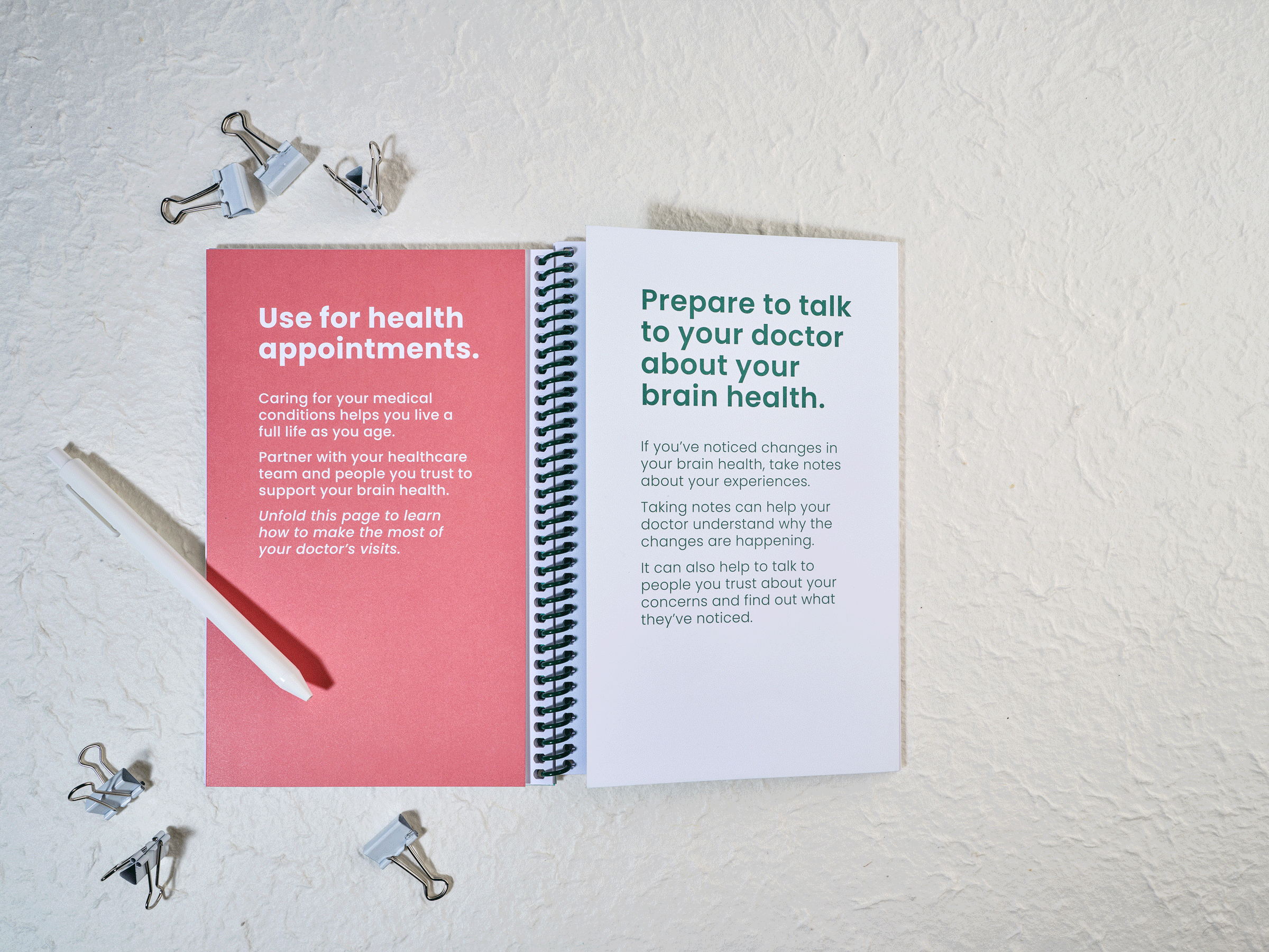
0B ● SHARE NOTES
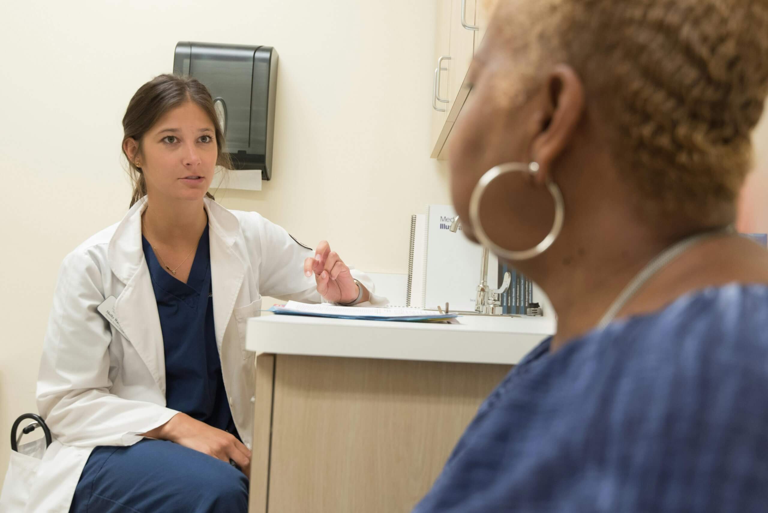
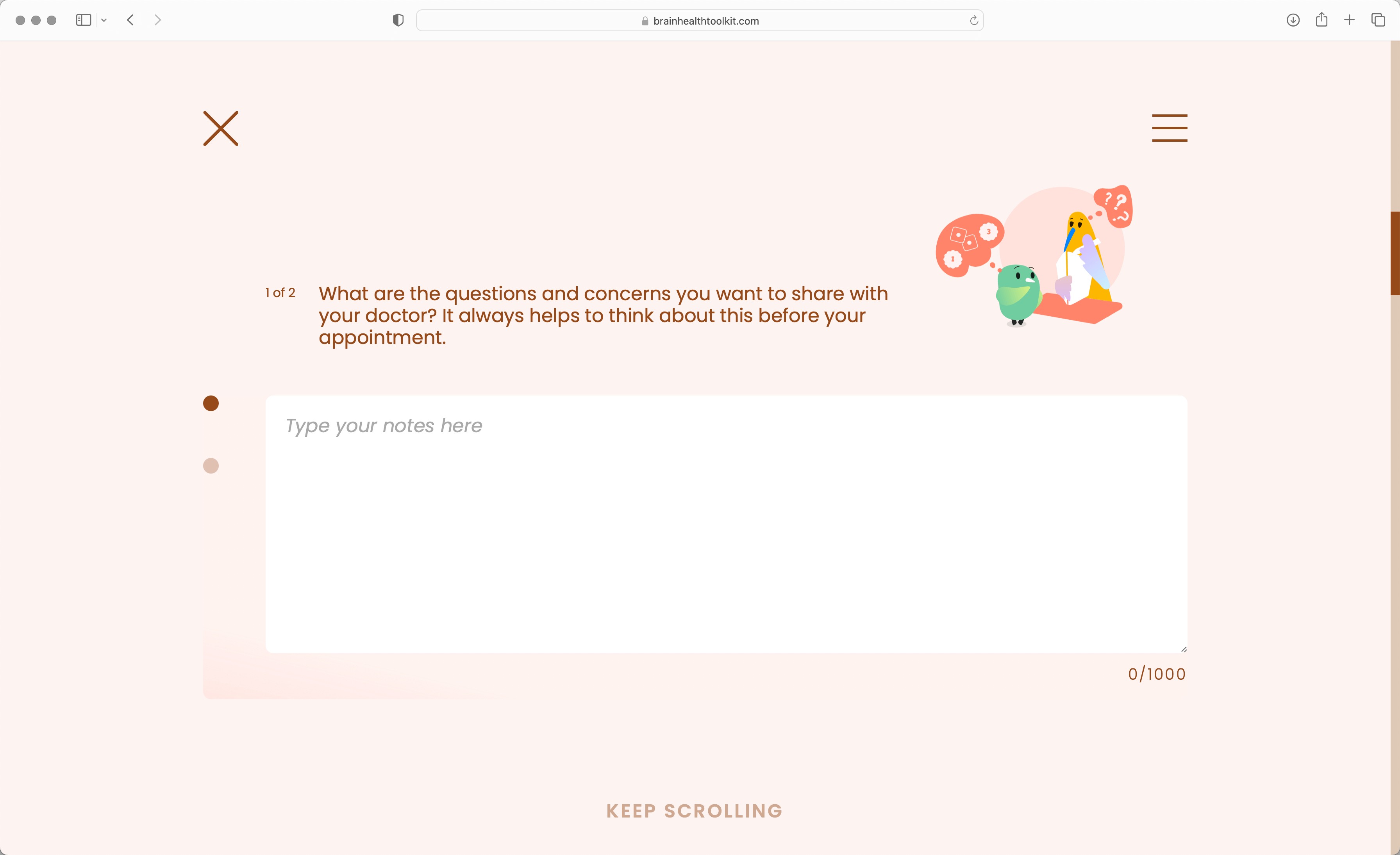
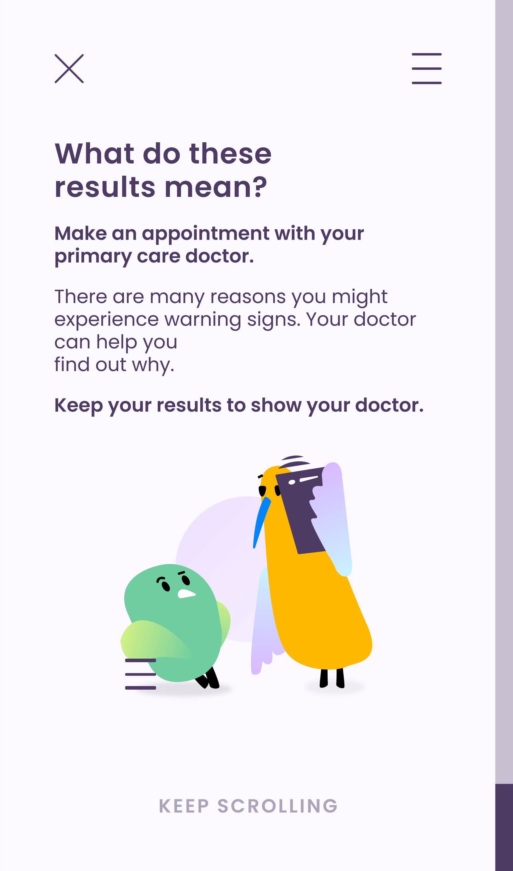
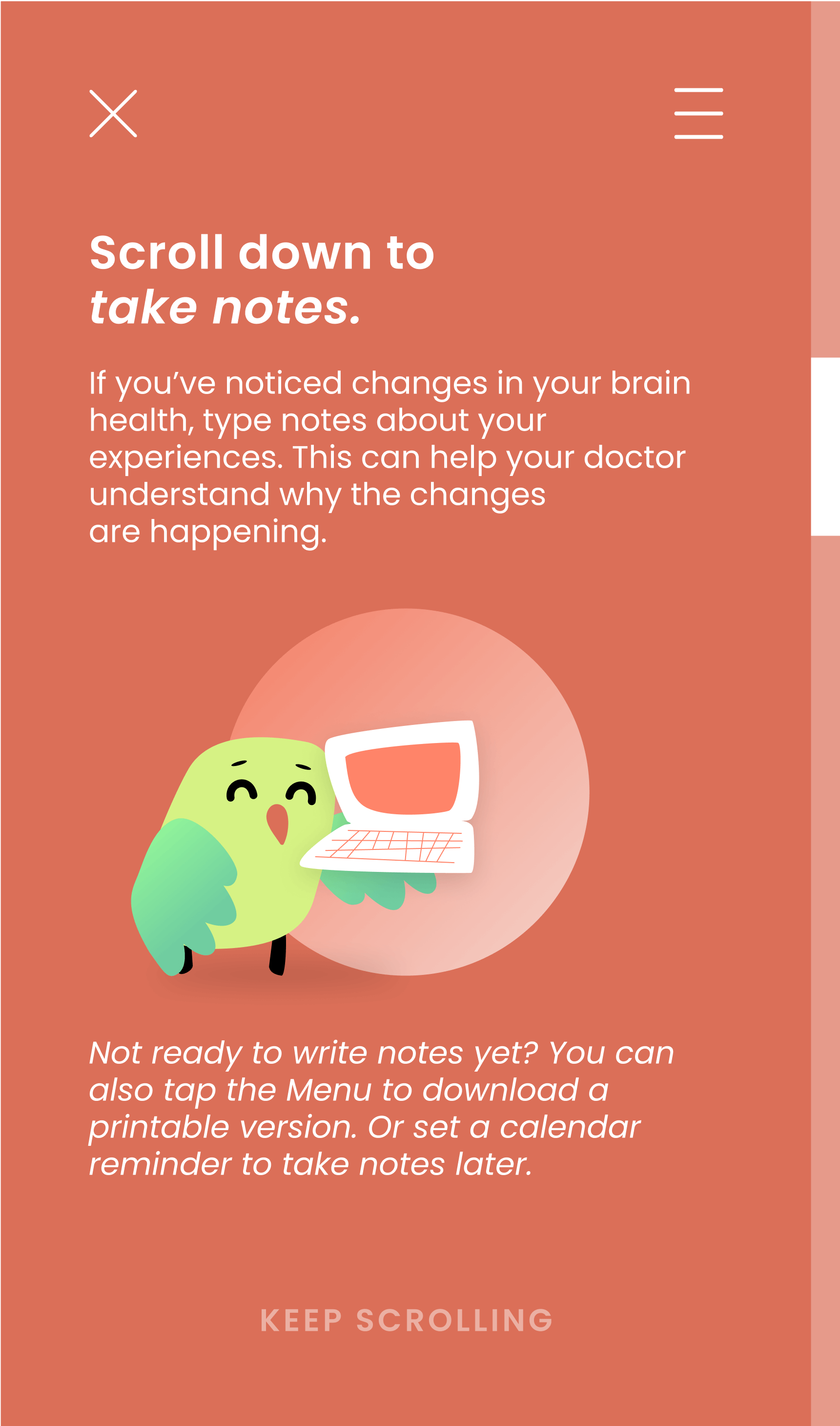
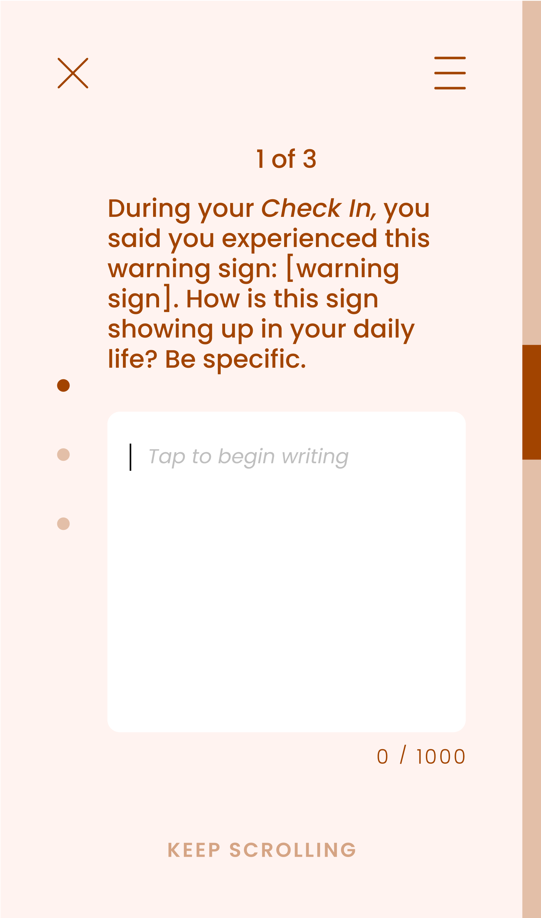
A note-taking tool with tips for regulating fears and anxieties that come with tracking and sharing signs. Patients learn how to self-advocate during doctor visits where most do not feel empowered. On-the-go sizing helps to mitigate social stigma and normalizes collaboration with their community: doctors, friends and family.
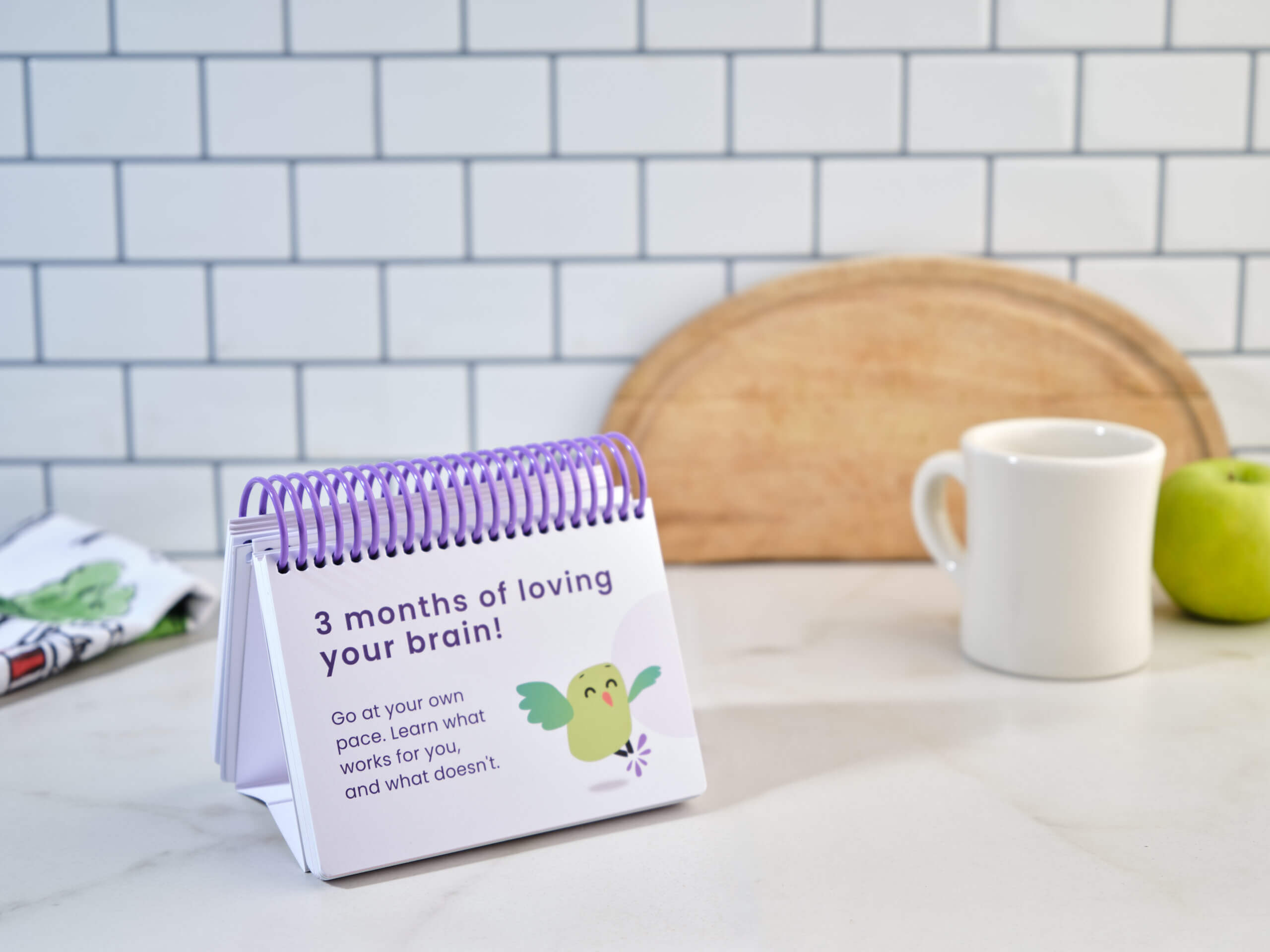
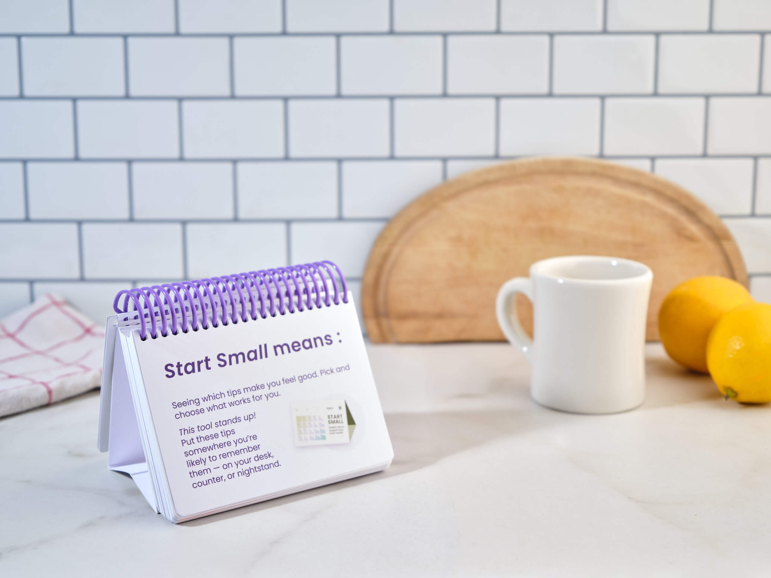
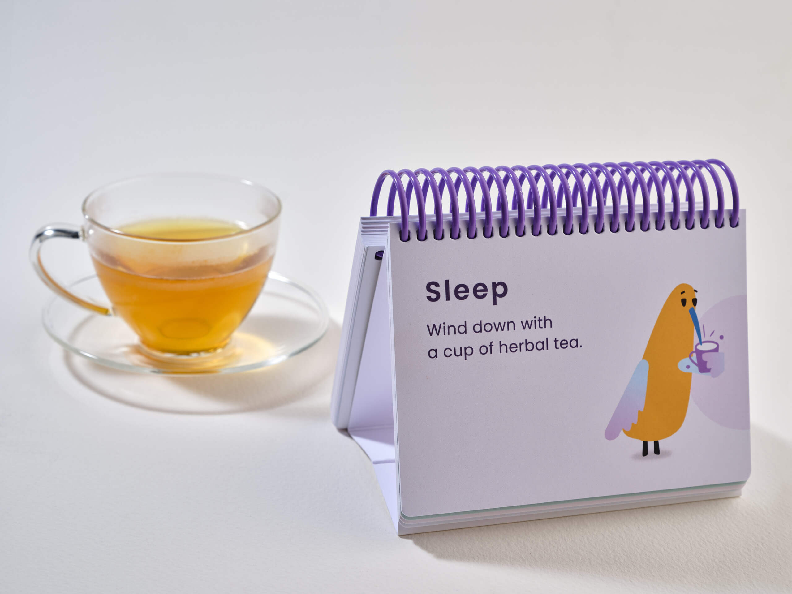
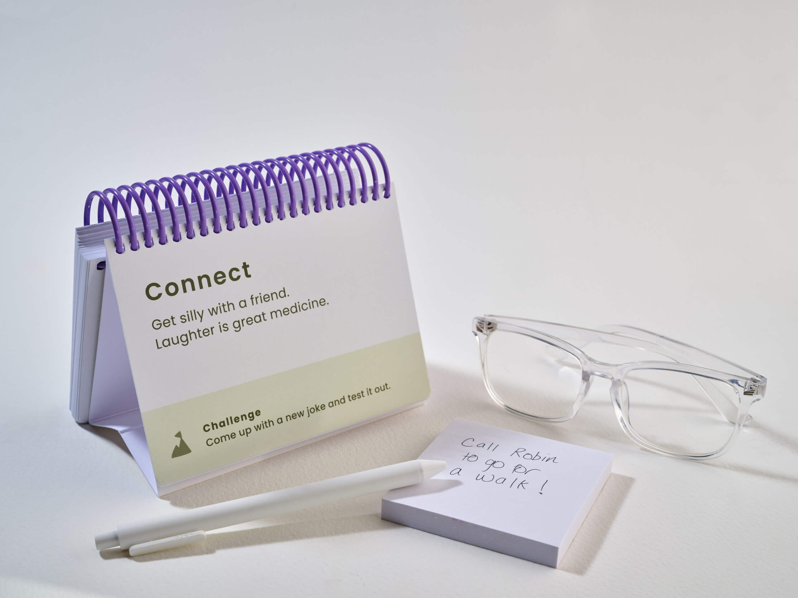
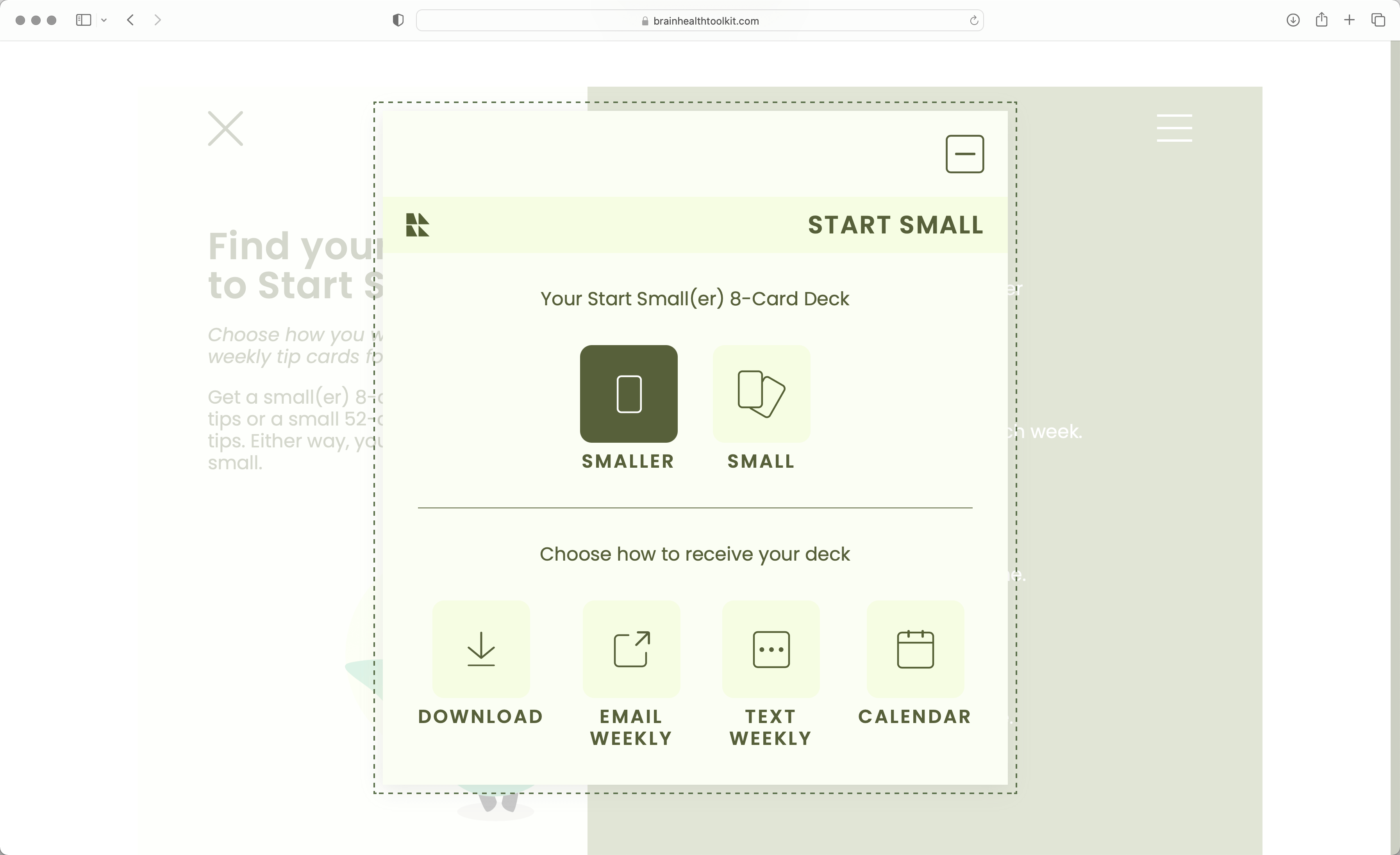
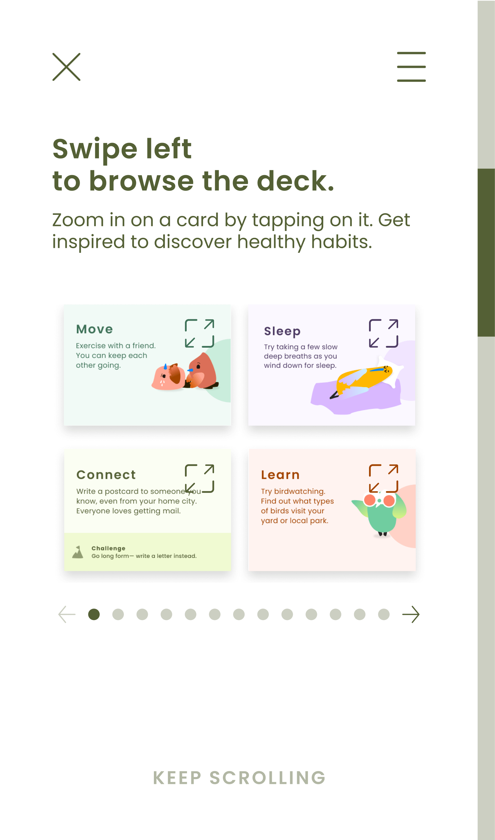
0C ● START SMALL
A desktop calendar of concrete, accessible tips increases awareness and understanding of practical ways to support healthy brain aging. The place “anywhere in your home ” structure of a stand serves as a subtle, physical reminder. Flippable, 52 weekly reward cards and leveling up challenges encourage engagement. And the socially-aware birds provide a relatable but constructive context for each tip.
04 ► Digital Kit Features
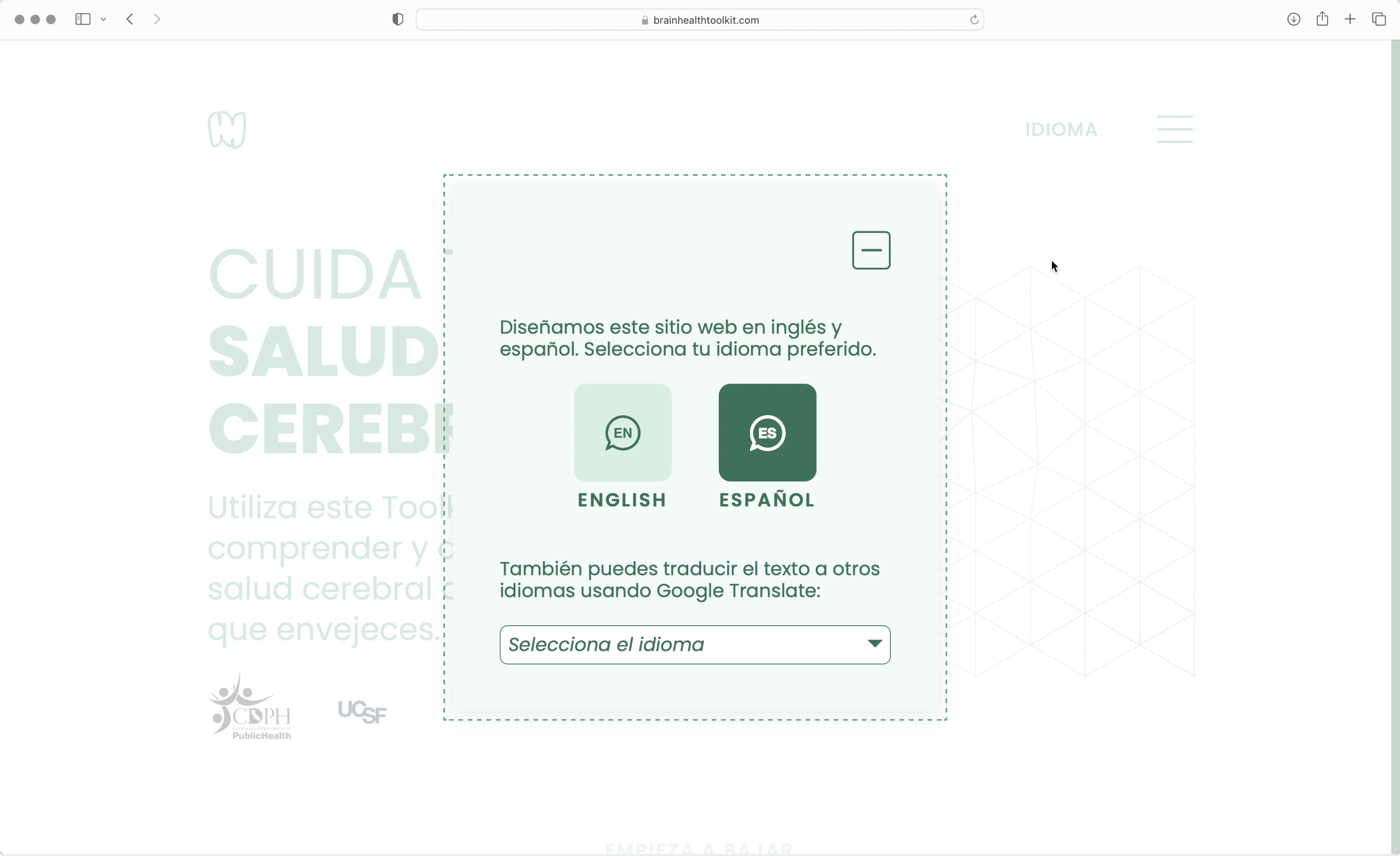
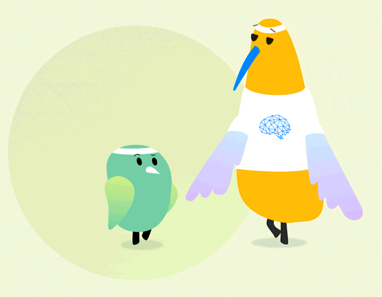
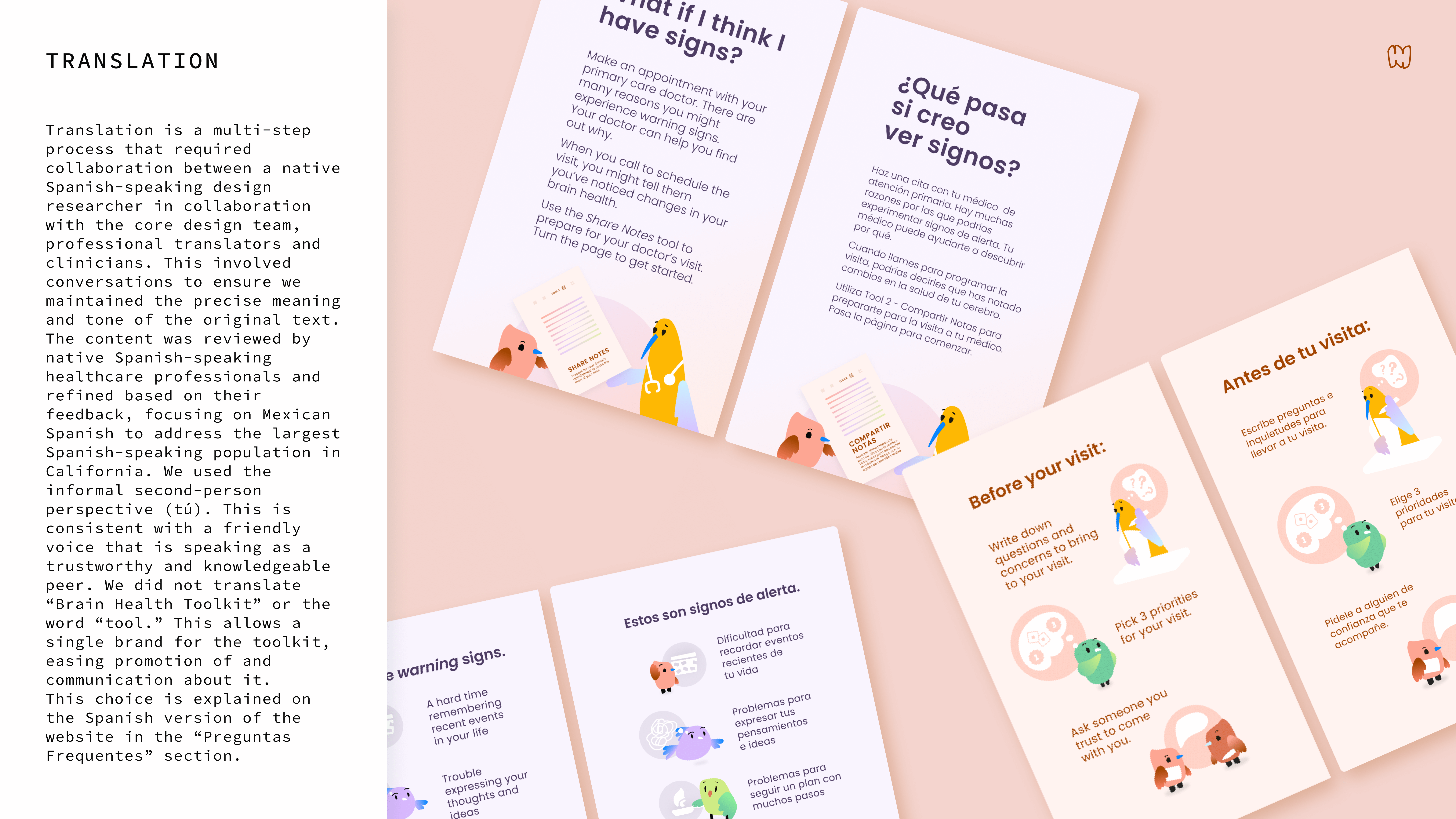
To reach communities that are continually left behind, I led the design for a digital website still accessible to an audience who prefers tactile tools: intuitive interventions like continuous scrolling to guide site navigation, charming animated characters to orient users in steps, and accessible UI elements (WCAG compliant) to provide single tap tasks.
Aware that this demographic will eventually age into digital proficiency, I built a system that will also gracefully age by leveraging optional enhancements: calendar or text weekly signups, language selection, and in-context writing tools.
Finally, I continued the playful, but soothing branding to decrease online stigma surrounding dementia and brain health.
05 ▼ Research Phase
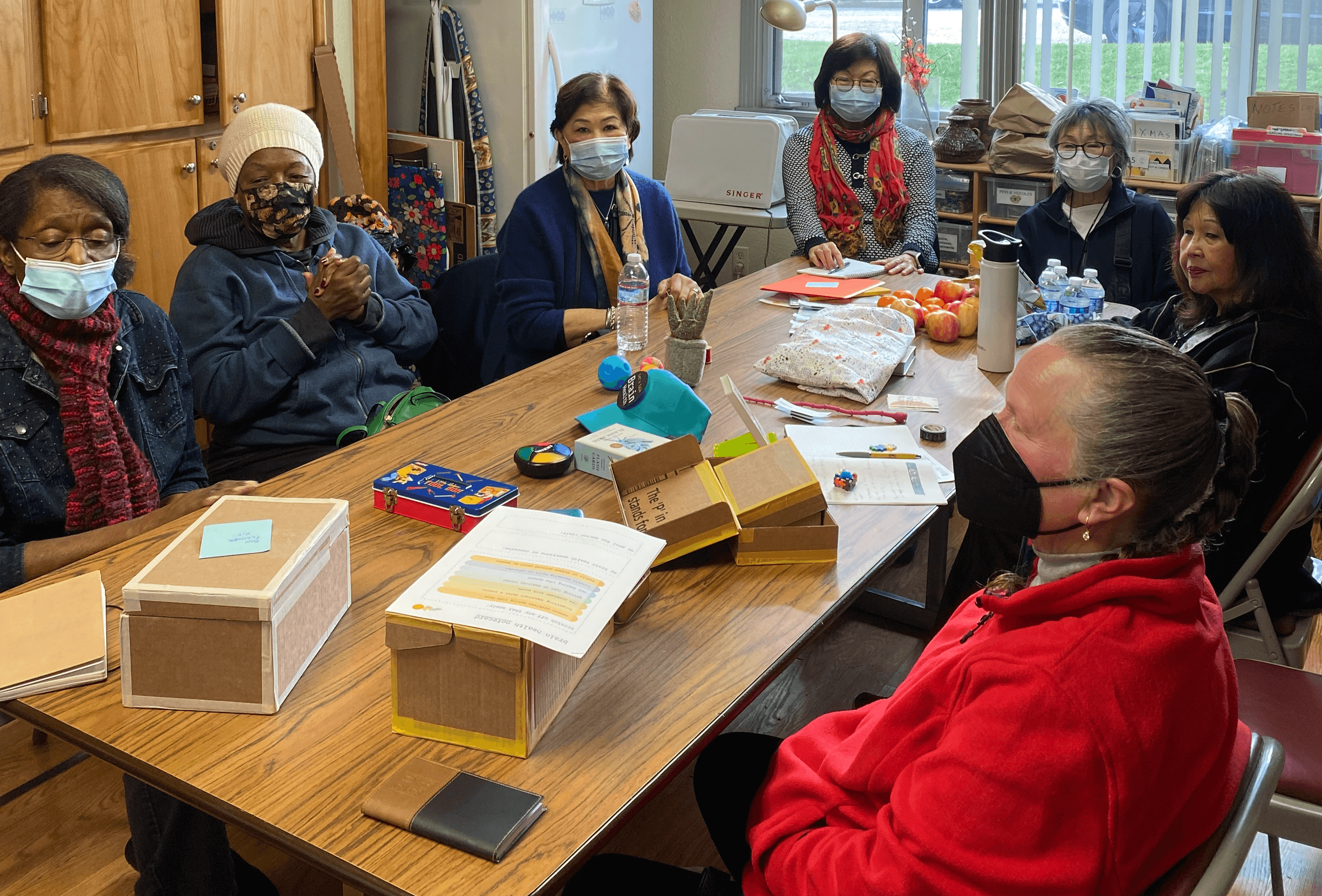
We visited a diverse range of community and senior centers to maximize audience reach across California (rural townships, english as second language communities, health-desert urban neighborhoods, etc.), observing and hearing from 55+ citizens. Individuals and their loved ones shared with us during in-context interviews and provided feedback on prototypes. We even connected with local community clinicians and took walks with neighbors (and their dogs) to understand how we can support everyday Californians SUPPORT their brain health.
Upon completion of R&D, I lead production on 2150 physical kits; from SKU material selection to designing a SKU tracking system. The team distributed these kits throughout the state, launching a very successful pilot. As of 2025, the state's health districts have started producing and launching additional physical kit releases.
“I checked into the digital version, and it is so cool! It is very easy to navigate from one section to another.”
- Pilot Participant
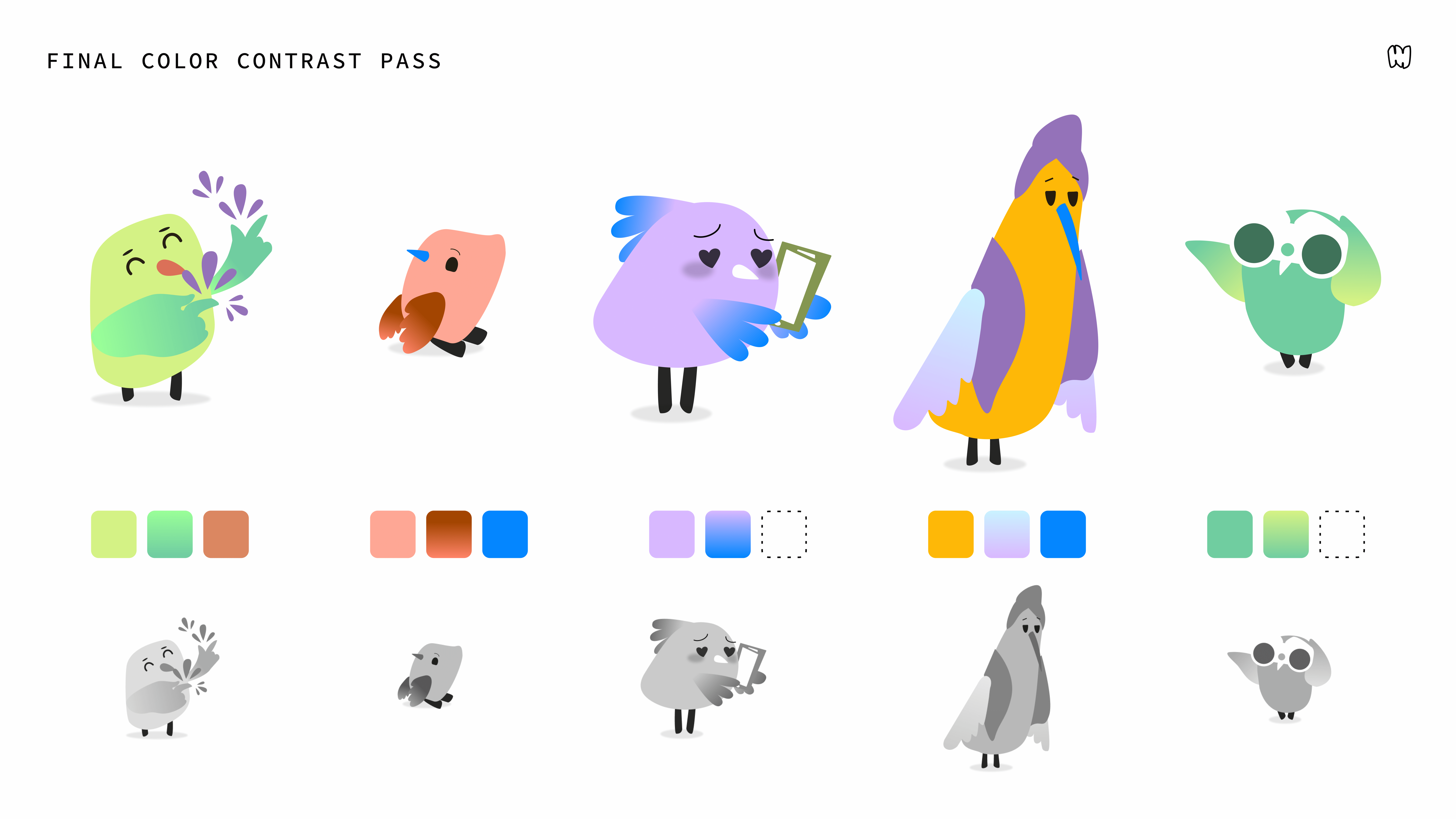
The pilot study demonstrated clear effectiveness across several key areas: participants found the content credible due to polished visuals and clear source references, felt relief after navigating the manageable self-assessment steps, and appreciated the calming, actionable next steps provided after identifying potential signs. Many were motivated to document and share their notes with clinicians, often feeling encouraged to book a doctor’s appointment. The experience of starting small, being rewarded for healthy habit formation, and viewing each tool title as an achievable call to action resonated strongly. Additionally, the bird characters were well-received for their playful, comforting nature, offering a gentle contrast to the emotional weight of self-recognition often triggered by human photography or illustrations.
06 ► Design Playbook
To achieve our pilot goals of reaching 2.5K readers and 1K unique online visitors with 30% Check-In Tool completion, I focused design development on three key areas: cognitive learning through voice and tone, building trust through identity aids, and physical-to-digital conversion.
0A ● TONE & VOICE
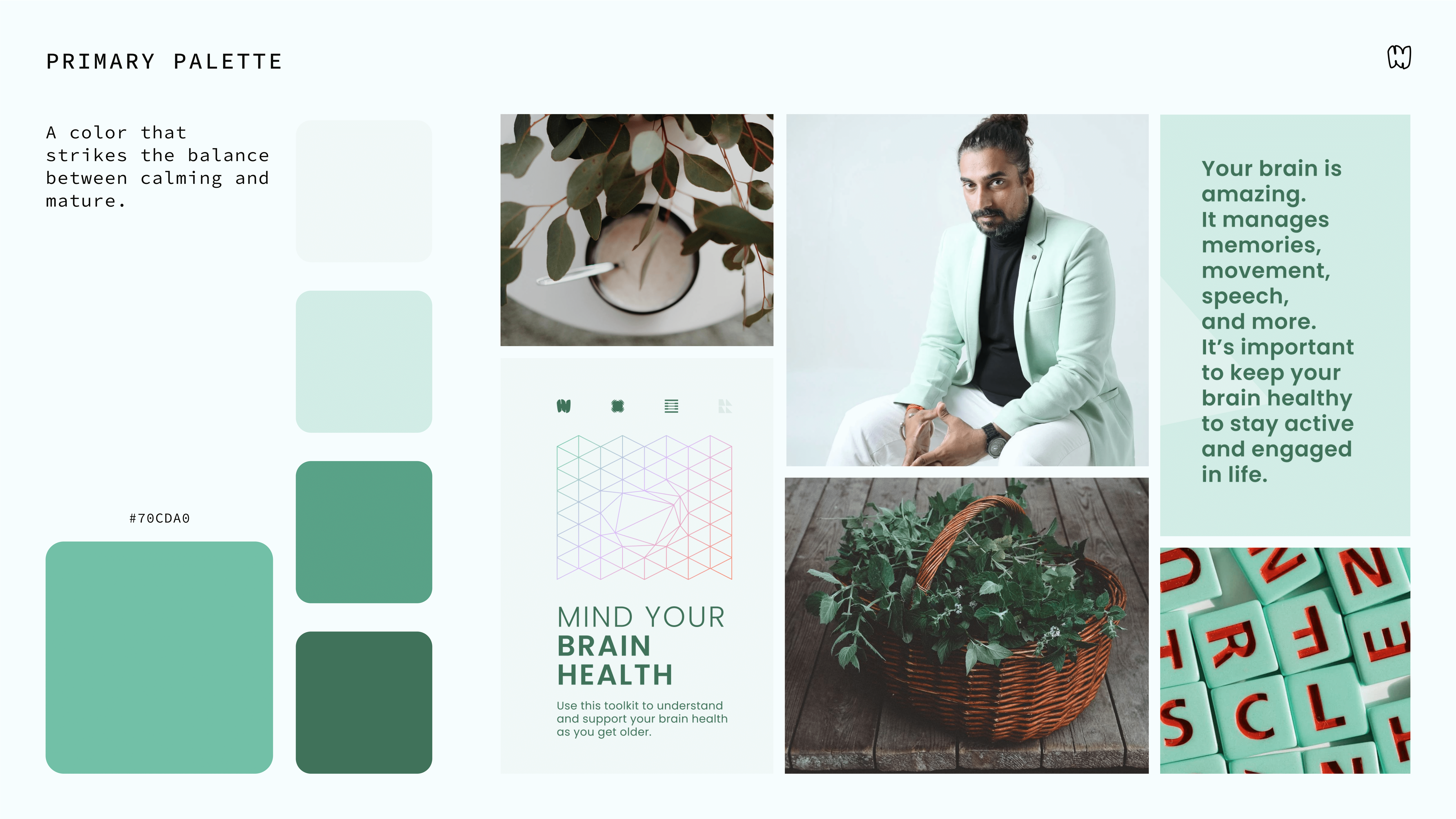
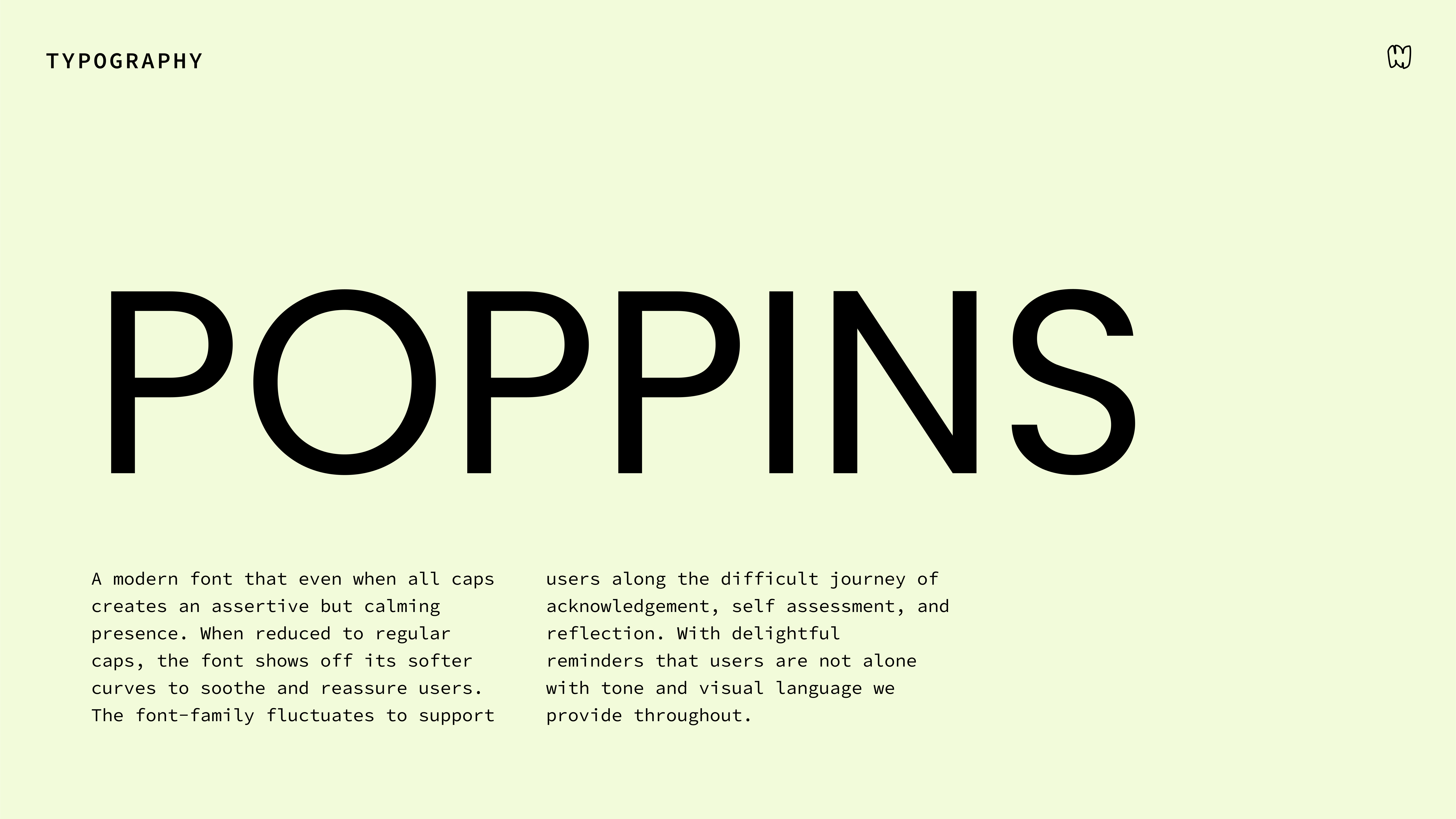
In developing the branding for this project, I decided to make a system that creates a mood rather than a visual identity. The color palette and layout grid were carefully chosen to encourage pattern recognition while minimizing content and maximizing spatial openness for a visually soothing experience. Working as a team, we crafted a reading tone full of straightforward language to build trust and keep the ideas relatable. I also experimented with the juxtaposition of text with the imagery. For example, I used visual humor following difficult talking points to create cognitive palate cleansers.
The resulting mood became an intentionally polished keepsake, something with value beyond a standard medical flyer. It was essential that the branding felt sophisticated yet approachable while offering the audience a visually engaging and memorable experience by mixing nostalgia with contemporary functionality.
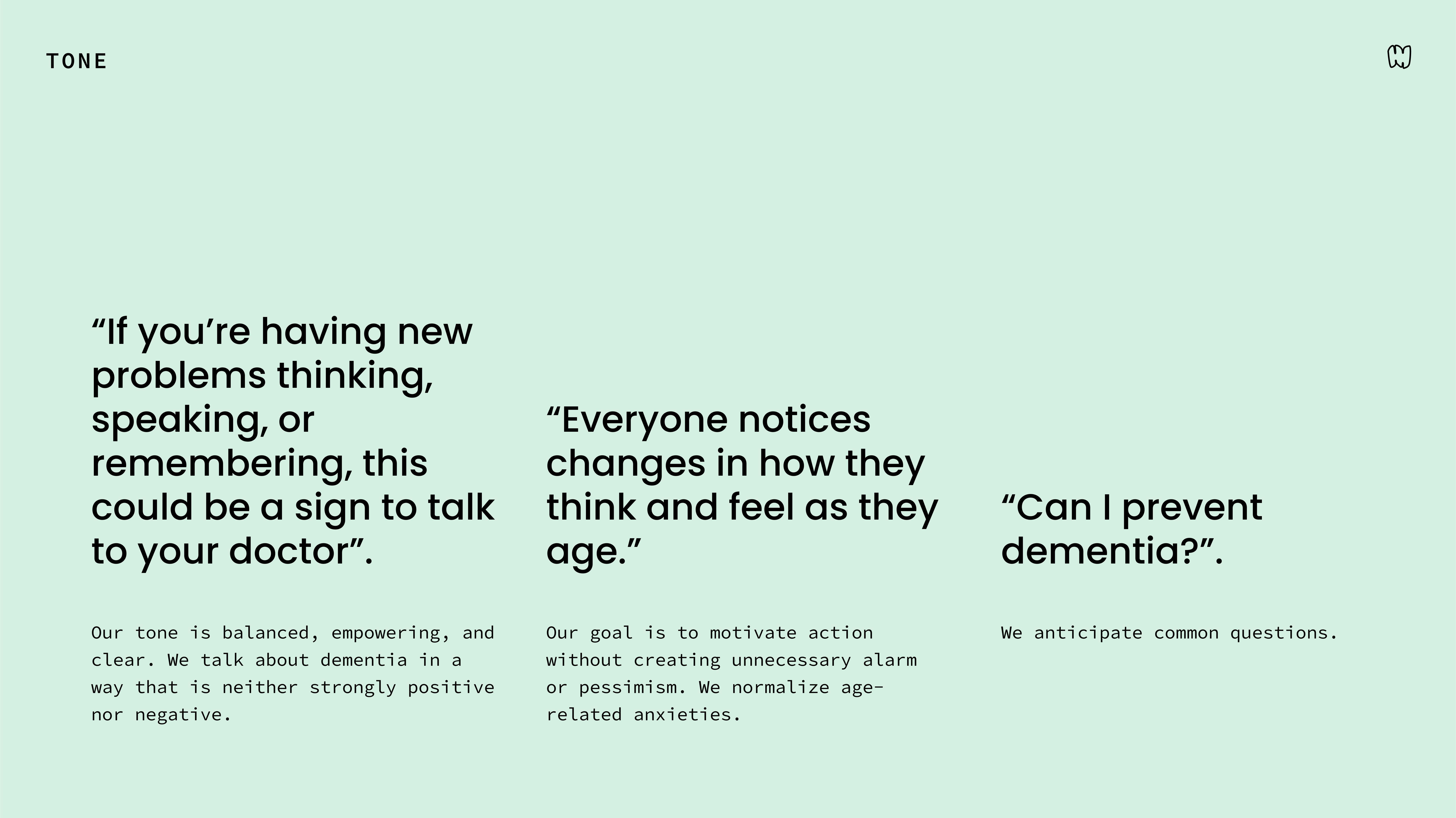
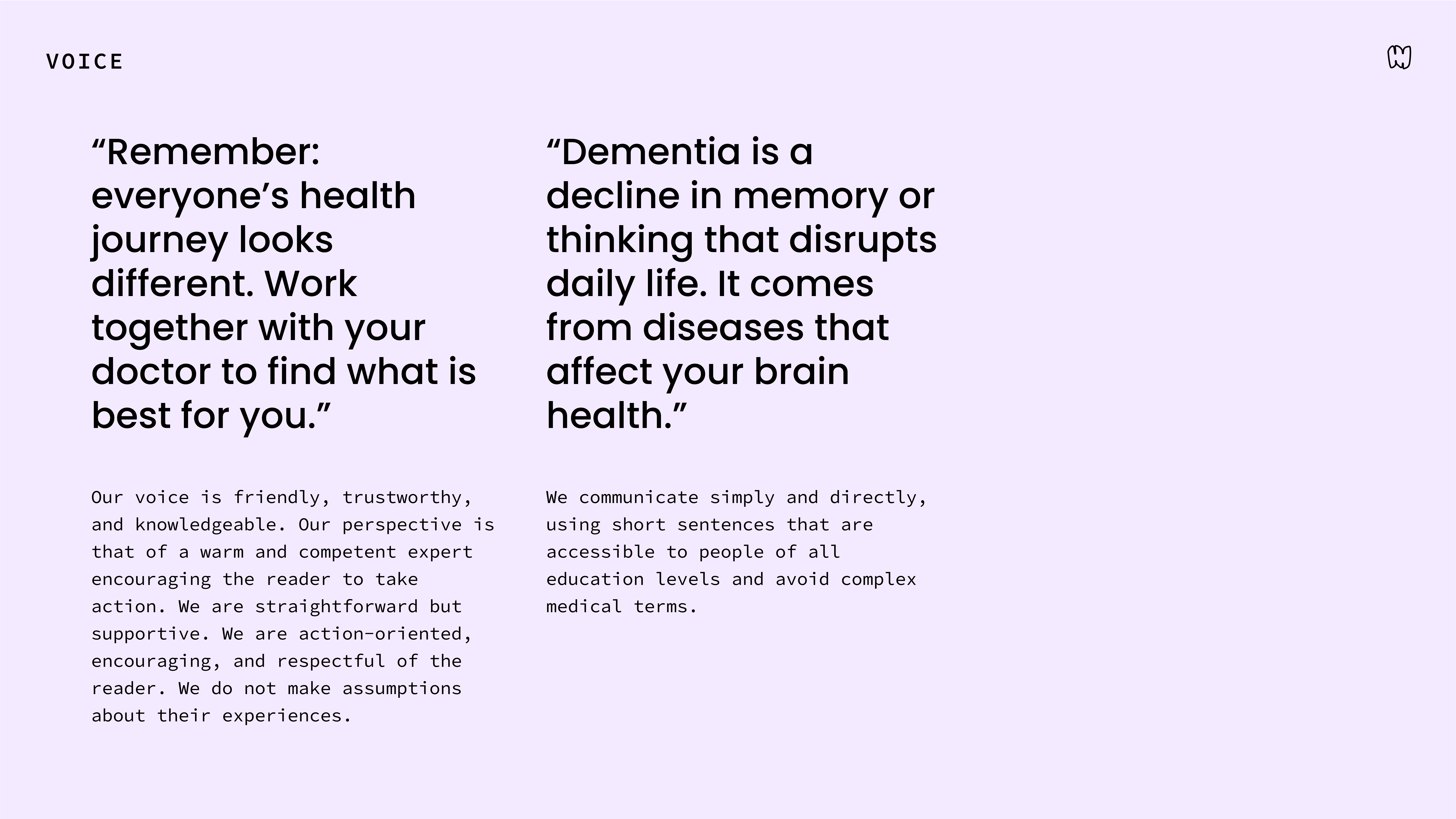
The process began with research into analogous health experiences, where we found the aesthetic landscape to be generic and often tone-deaf. To break from that, I drew inspiration from 1960s and 1970s design, when much of our audience was in a period in their life where they were setting the cultural trends and open to new experiences.
The branding from there evolved iteratively, embracing exaggerated contrasts and accessible sizing, with the goal of making material digestion even easier. The highlight for me was prototyping patterns, inspired by motion graphics, designed to create soothing visual rhythms when paused. I was also thinking ahead, considering how a 2D design can later evolve onto a digital platform with dynamic and adaptable elements.
0B ● VISUAL AIDS
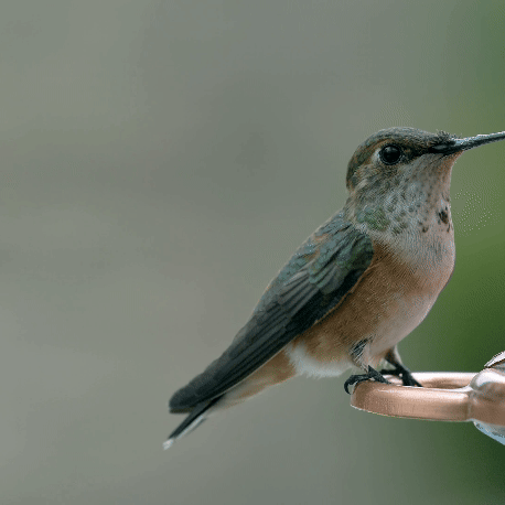
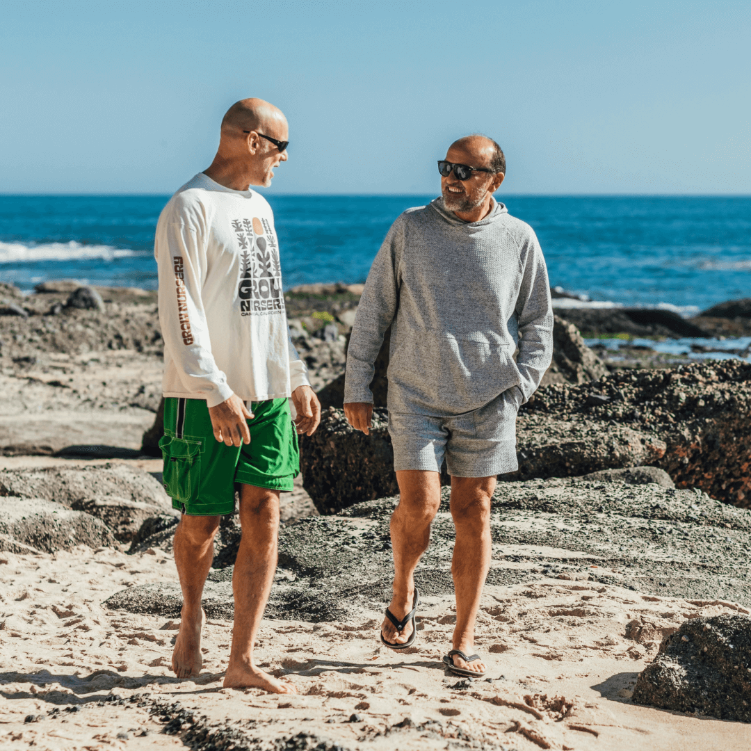
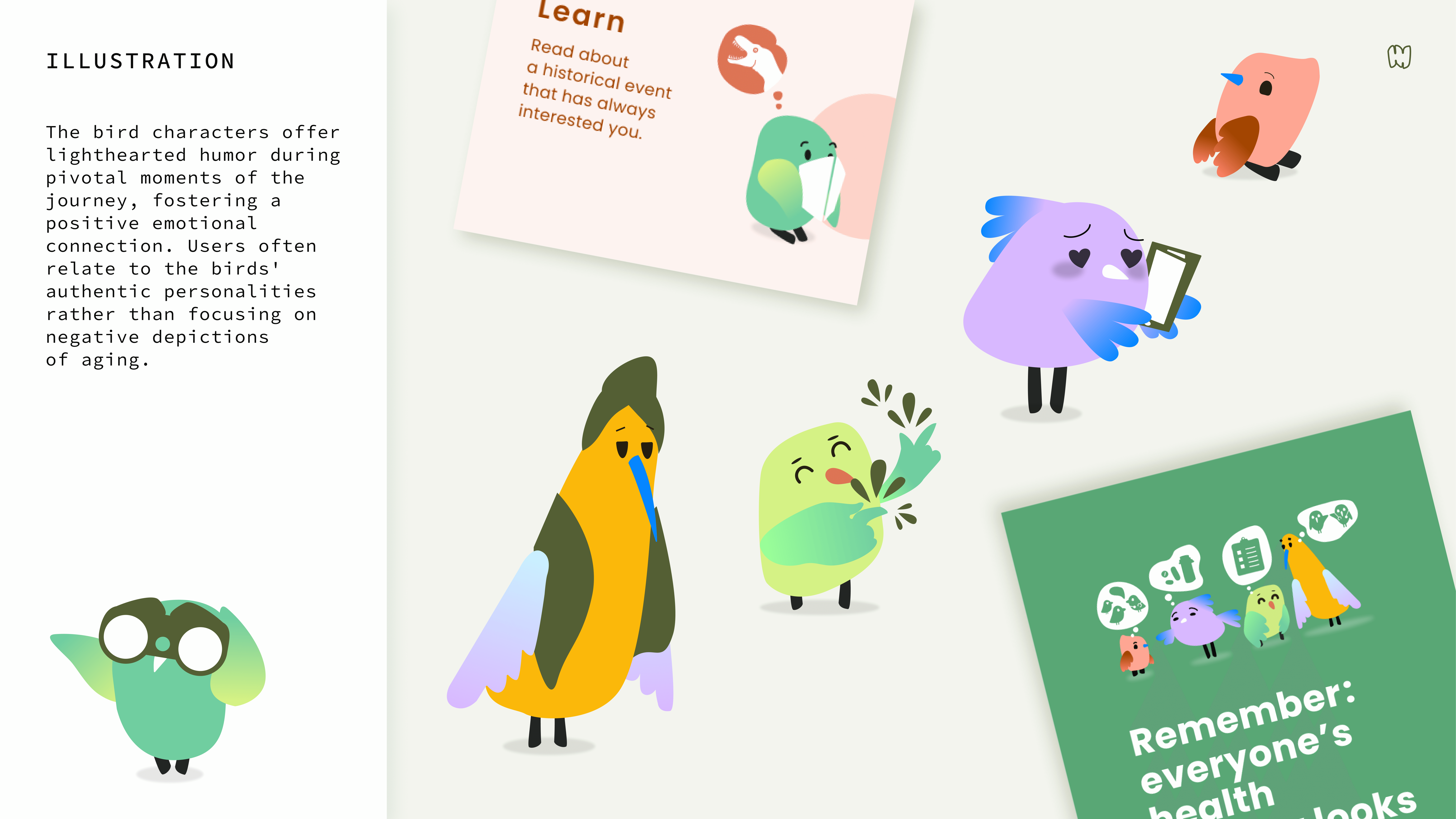
Early in the layout process, I included photographic stock that depicted the diversity and the realness of our users' contemporary lives. When we showed these early prototypes to users, they reflected how they can see themselves in the photography... someone with gray hair and wrinkles to match. The challenge for me became clear: how could I create something relatable but fun and lighthearted without being condescending?
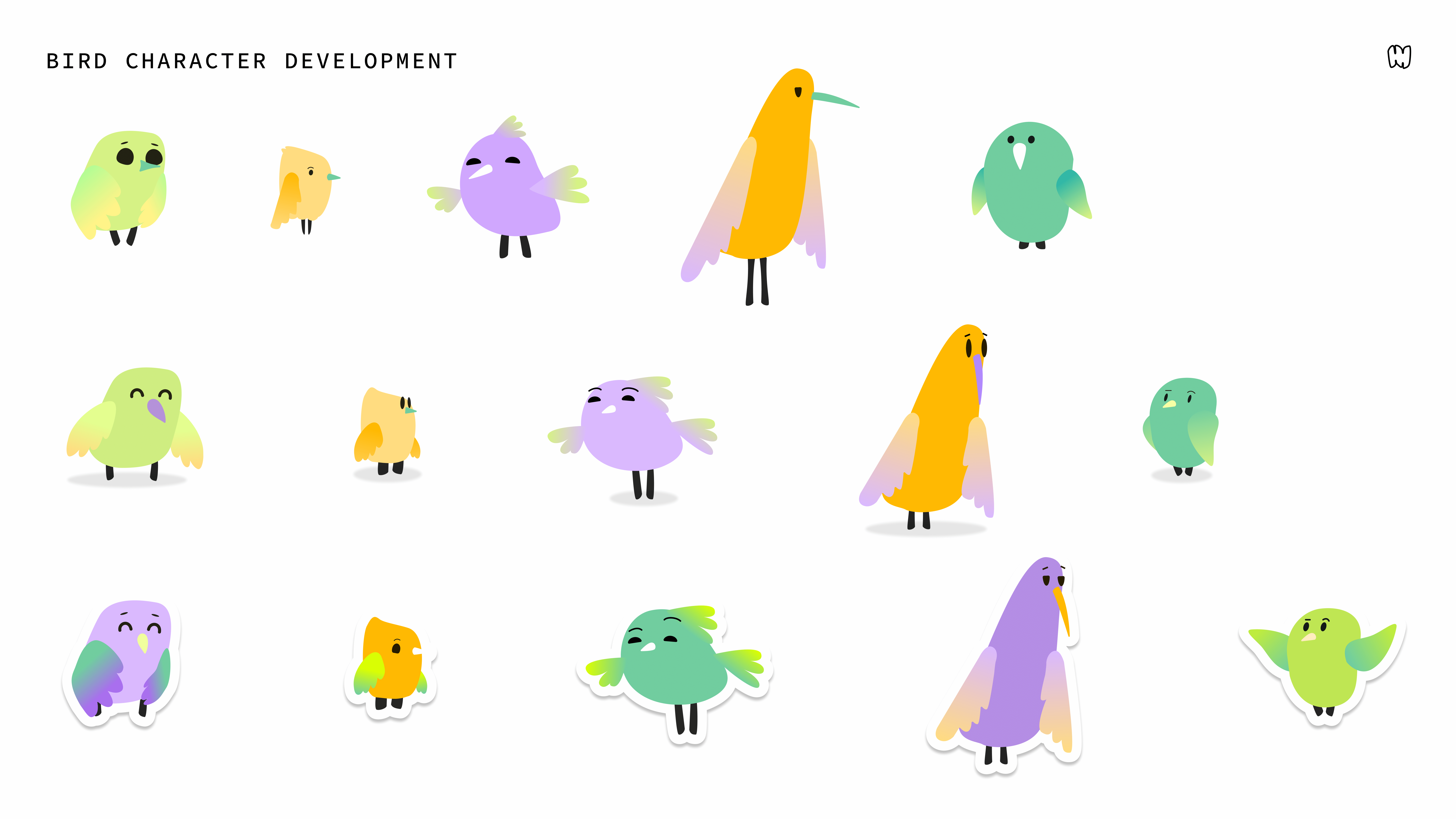
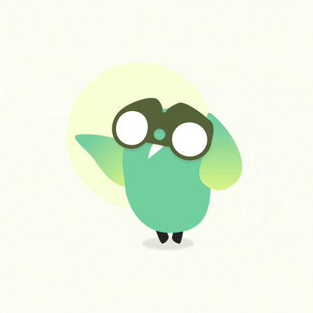
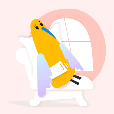
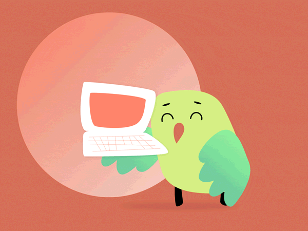
Bird watching kept surfacing in conversations as a key interest for our audience, which really sparked my curiosity. Leveraging this enduring passtime gave me confidence I could design personality based visual aids in a way that was both accessible and joyful. Through our research, I met a range of fascinating people that were real characters. Drawing from our audiences’ life experiences, I built a library of bird players that I could place at key moments when their dynamic trait was needed to uplift or embody the defining instance.
The result was a set of bird characters that everyone we shared the kit with, formed enthusiastic connections with. Still pulling reality into the imagery development process, these characters ended up feeling more authentic and timeless than photographs.
0C ● FROM PHYSICAL TO DIGITAL
This campaign centers on changing habits through fun, functional exercises. My research lens, therefore, focused on understanding our audience’s everyday habits to design tools that easily fit into their daily routines. From the insights, I developed a list of possible user trends and tools and led a "matchup brainstorm" to find the most compelling and actionable ideas.
Like Easy-to-navigate layouts that resemble celebrity quizzes / brain teasers or bettering your life activities kept organized by day planners, cook books, easy-tear-outs and desktop calendars.
When transitioning from physical to digital, we refined the list to translate successful interactions into effective digital features using a “digitize storm.” I guided the team toward a clear feature set from first hand observations of the 55+ demographic interactions with tablets and phones.
The result is a digital experience that feels intuitive and seamlessly integrates into their daily routines: one-way navigation guides the user journey via continuous scrolling and reimagined UI elements prioritizing accessibility like large button sizes and clear labels.
From the start of this development shift, I created a “state document” to collaborate with our remote website developer. As this was our first project together, I used the shared document to understand his preferred terminology, establish the development order, and align cross-functional mindsets while developing the site.